

Refactoring the service selection component for the Nearcut Design System
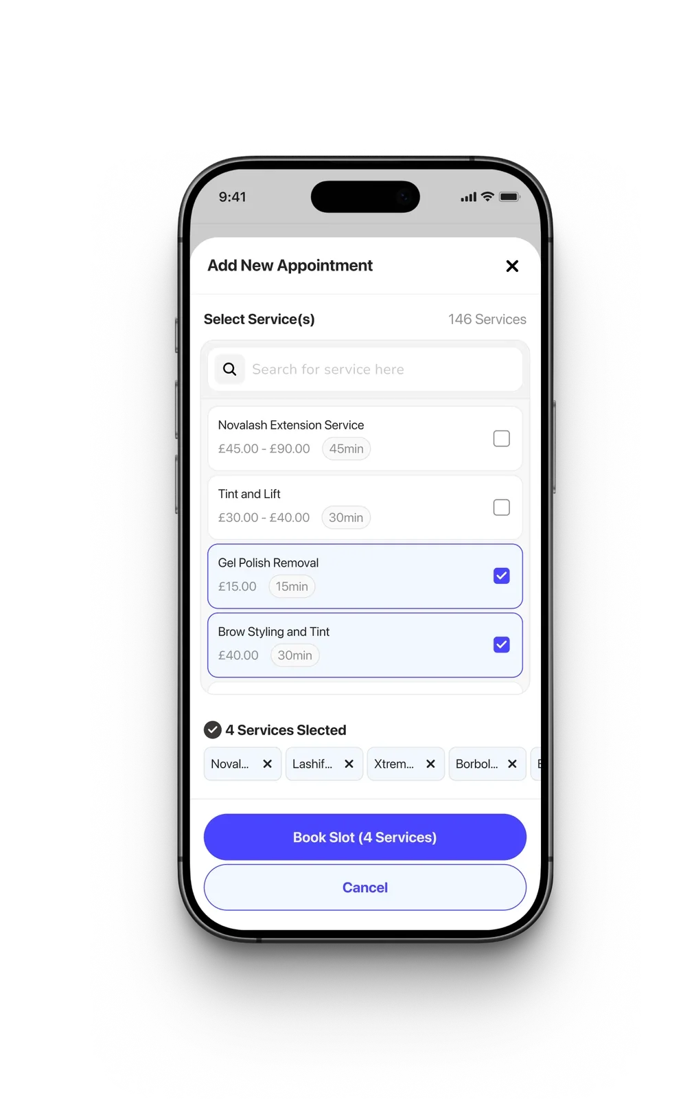
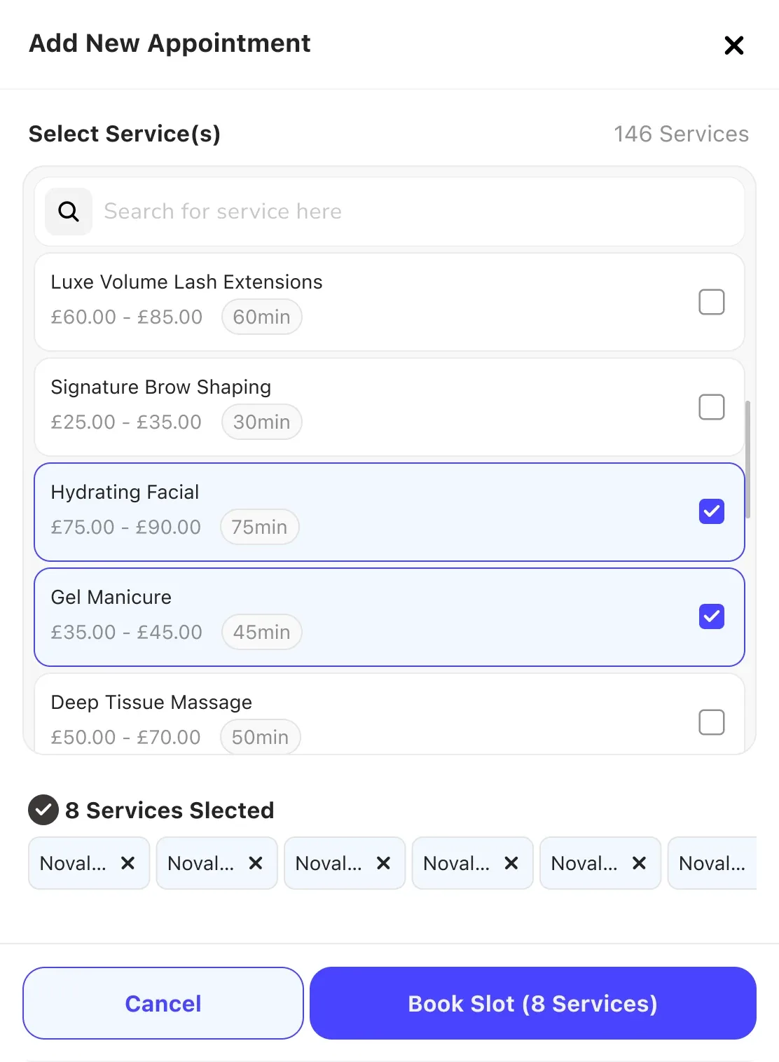
The Add New Service component is a core interaction within the booking and setup flow, enabling business owners to select and configure the services they offer. The original experience lacked clarity, scalability, and efficient multi-selection, especially for businesses with large service catalogs.
This redesign focused on improving usability, speed, clarity, and scalability while ensuring the component could support future feature expansion.
My Role
As the UI UX Designer I was responsible for:
- Interaction design and information architecture
- Component design and state management
- Accessibility considerations
- Collaboration with PM and developers
- Design documentation and handoff
Our Goal
To design a component that allows users to:
- Quickly find services using search
- Select multiple services efficiently
- Clearly see what has been selected
- Understand pricing and duration at a glance
- Manage large service lists without cognitive overload
Process - Rapid Iteration
Problem Identification
From usability feedback and product usage patterns, we identified that users struggled with:
- Finding specific services in long lists
- Tracking what had already been selected
- Understanding service details without opening separate views
- Removing selections easily
Top Insights from our data revealed
Worse Case Scenario
The highest number of services booked in an appointment was 10 services
In the last month
- 1 appointment had 10 services
- 1 appointment had 9 services
- 2 appointments had 8 services
- 6 appointments had 7 services
- 61 appointments had 6 services
- 288 appointment had 5 services
Data provided showed
The highest number of services on one system was 126, while the average was 7 services
In the last month
- Probably about 500,000 appointments had 1 service.
- A total of about 850,000 appointment per month,
Data provided showed
About 1000 shops have more than 6 services and about 1300 shops have less than 6 services (because the median is 6)
UX Strategy
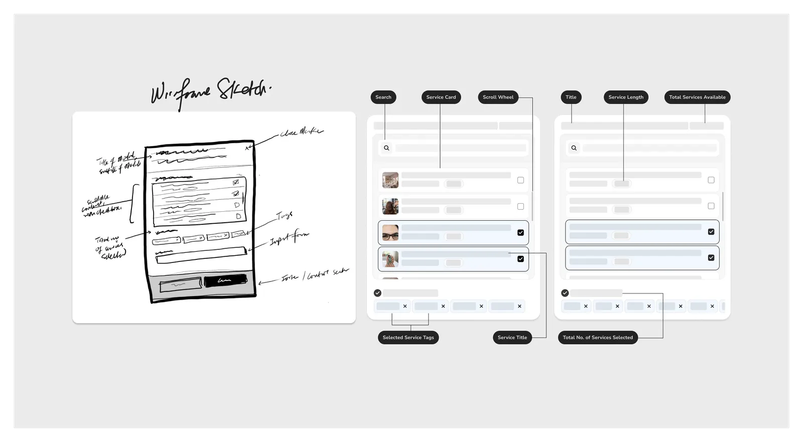
After reviewing the data insight and collaborating with developers to understand the technical limitations, I created a sketch and a wireframe of the component structure and layout. I particularly focused on Reducing cognitive overload through visual hierarchy, Improving easy scanning of service items, supporting bulk selection and making system state visible at all times
Design Decisions & Solution
After sharing the wireframe sketches and low fidelity component structure with stakeholders, I got a sign off to proceed with creating the component and documentation for the developers. Some key improvements included:
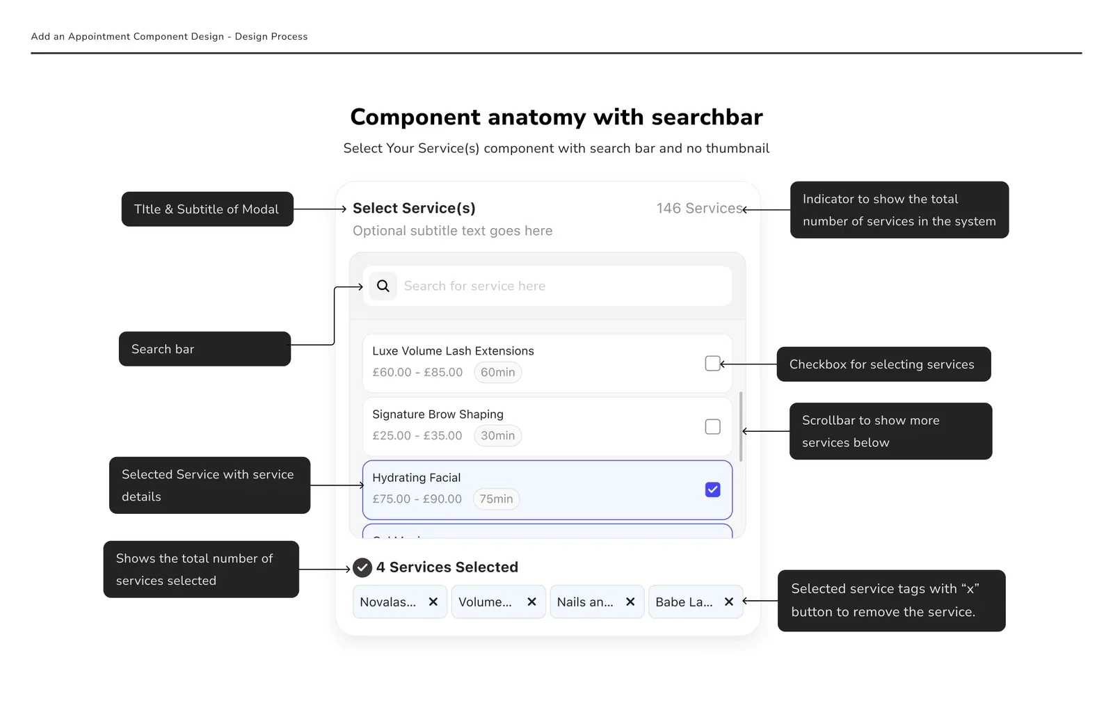
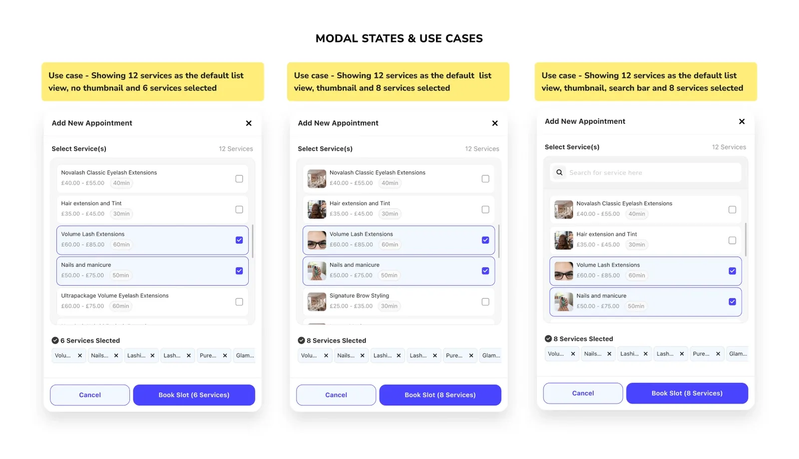
- Search-enabled service list for faster discovery
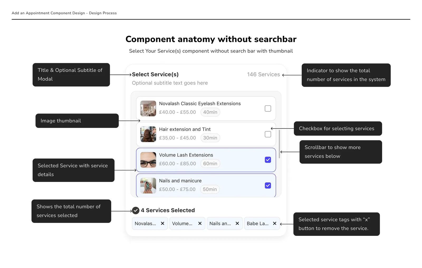
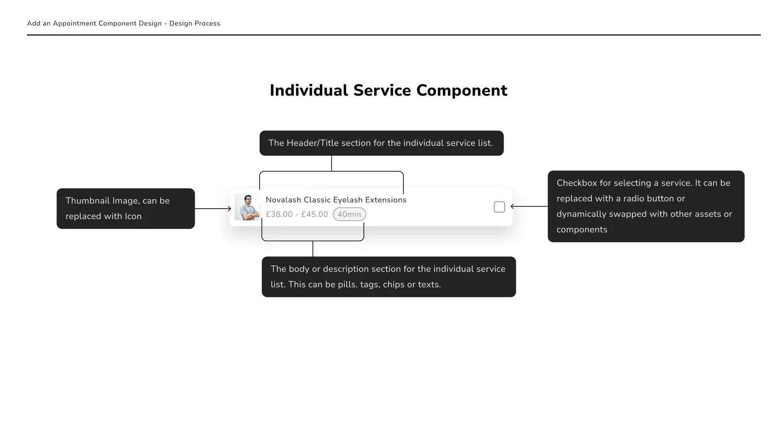
- Clear service cards showing name, price range, and duration
- Persistent checkbox selection for multi-select clarity
- Live selection counter to reinforce system feedback
- Selected service tags with quick removal actions
- Scrollable container to handle large datasets
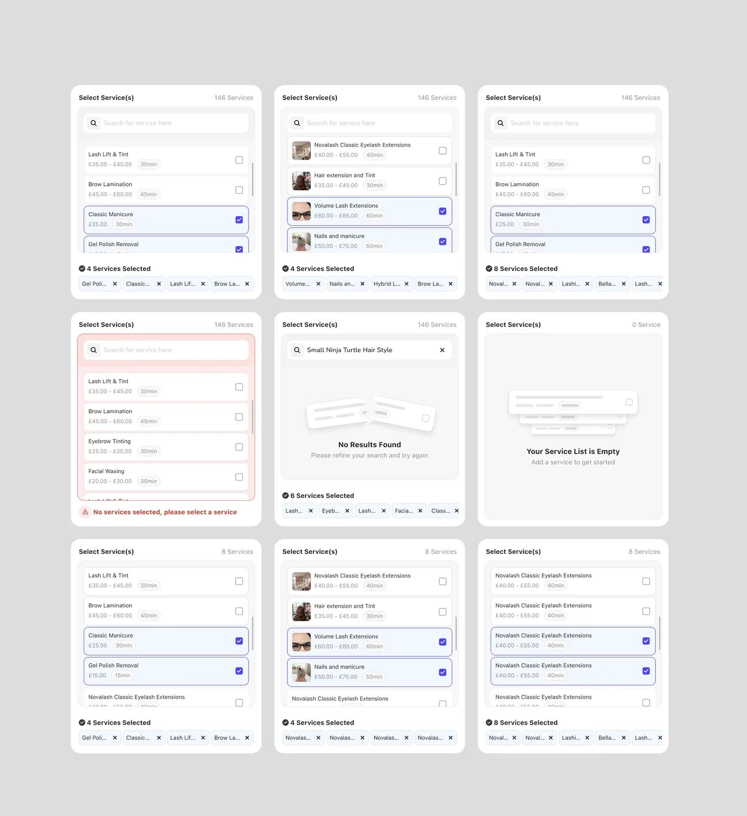
- Strong visual states for selected vs unselected items
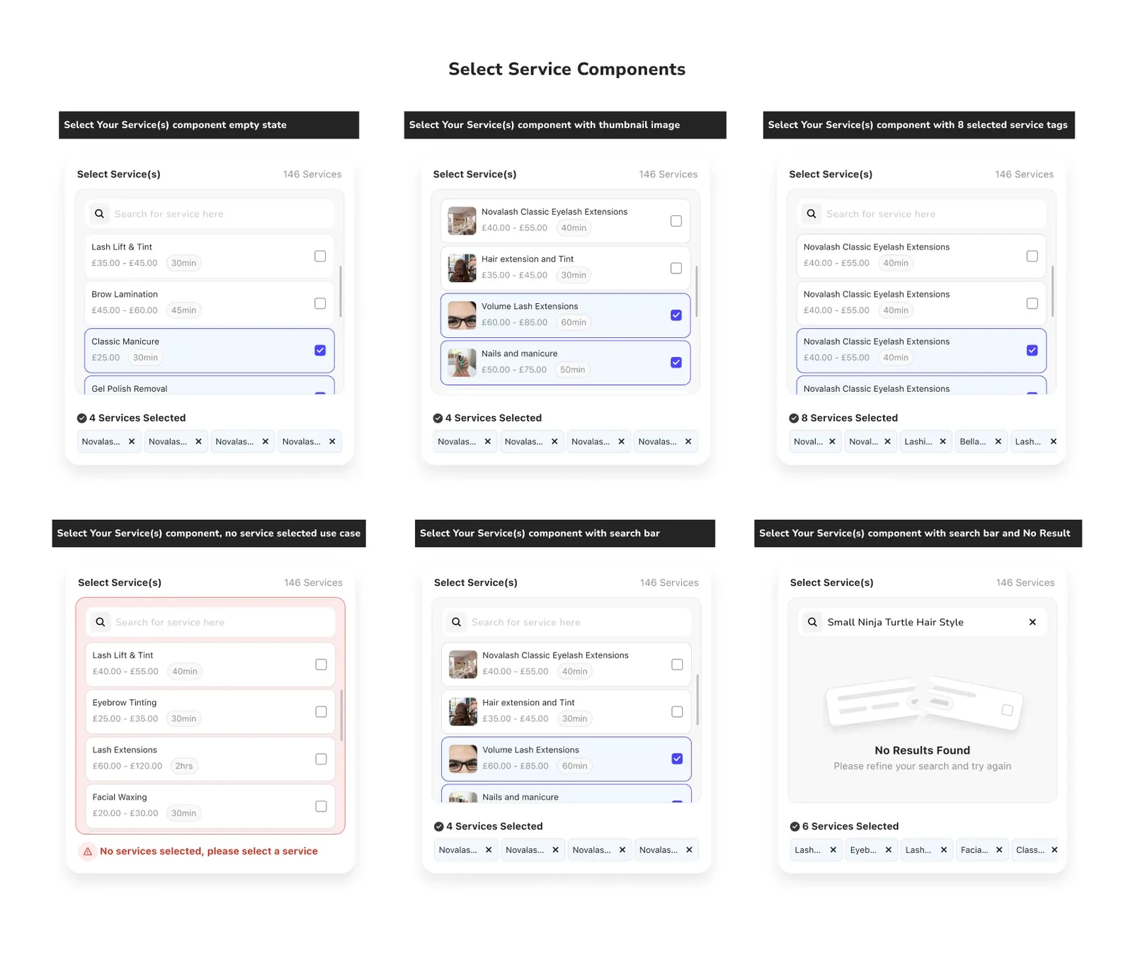
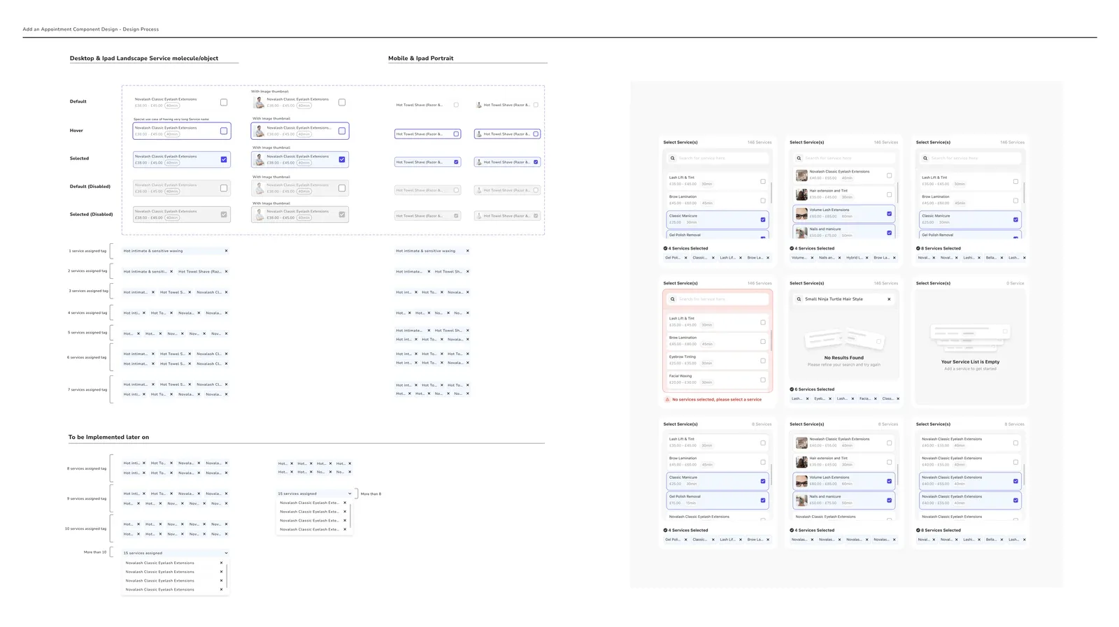
- Edge case handling for empty states, error state and no result found state
Component Anatomy System
I tested the designs against several edge cases such as character length, time range, thumbnail images absent, overloaded service selection tabs and different language translation as this was important because the booking software caters to different regions like Germany and France.
I created extensive documentation for developers and also documented the component as a modular system with:
- Header and contextual indicators
- Search input
- Scrollable service list
- Selection states
- Selected item summary
- Removable tags
This gave the developers the ability to reuse and scale the component across multiple flows and device types (Mobile, Desktop, Tablet).
Outcome & Impact
After deploying the components and successful A/B testing within a selected group of users, we recorded some significant improvements especially during the service setup flow. Some key impacts were;
- Reduced friction in service setup flows
- Improved clarity and confidence during multi-selection
- Designed for scalability as service catalogs grow
- Reduced dependency on additional modals or screens
- Improved accessibility and usability for all users.
Learnings and Reflections
My redesign and approach to creating this component was solely data driven. I engaged in several meetings with the product owner and developer to understand the full scope. Being responsible for the design system gave me an insight as to how our tech stack and responsive layout worked. I believe in a forward thinking approach to creating designs and this made me understand how important language optimisation, and applying a lean approach to design system optimisation meant.
This component sits at a critical moment in the user journey: business setup and configuration. Any friction here directly impacts activation, onboarding success, and long-term retention.
By redesigning this component, I ensured that users could move forward quickly, confidently, and without confusion.