

Optimising the Calendar Management Feature of BookinBeautiful & Nearcut's Booking Management System
BookinBeautiful & Nearcut have a B2B SAAS booking management system tailored to salons, barbershops and beauty professionals. It enables them manage appointments, staff rotas, clients, sell products, build and edit website, take payments and a whole lot of other features, all integrated into one system.
The calendar and appointment management system sits at the heart of the platform. it’s where professionals schedule, view, and manage their daily operations. As a core feature offering, user feedback, data and research showed pain points in usability, scalability, appointment management, and the efficiency of booking workflows, which affected our clients.
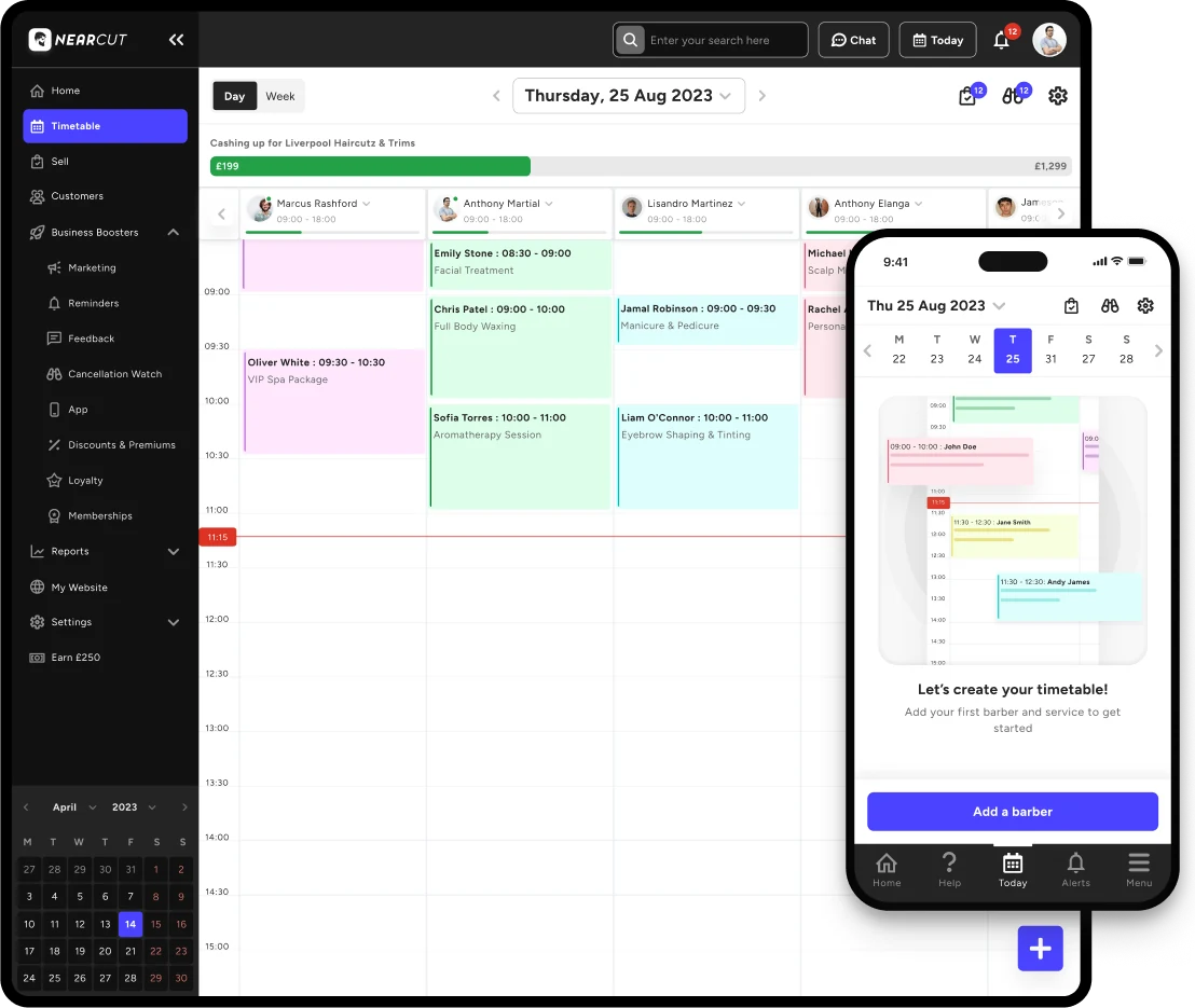
Increase in appointments managed per staff due to better visibility and workflow
Significant reduction in support ticket relating to calendar management
Reduction in vertical scroll due to full optimisation for mobile and tablet devices
The Challenge
The business north star metric had pivoted from primarily targeting barbers to now targeting beauty salon clients, and so our existing calendar management system was outdated and had several key issues which affected usability and caused a significant amount of churned clients. This was as a result of feedback from technical support and sales team. The calendar management system was our core product offering and we needed to refactor and optimise it in other to increase retention and usability.
Our Goal
Redesign the Calendar and Appointment Management experience and increase it's usability, make it clearer, efficient, less overwhelming and more intuitive. Also, we needed to optimise the user experience for smaller devices and scale to larger screens by considering technical limitation such as, old existing architectural logic. Subsequently, we needed to ensure we covered primary use cases (multi-staff management, appointment management and admin management) and scalability use cases (AI integration). Finally ensure our solution was flexible for future integrations such as advanced payments, multi-calendar view and future feature enhancements.
Process - Design Thinking
Discovery & Research
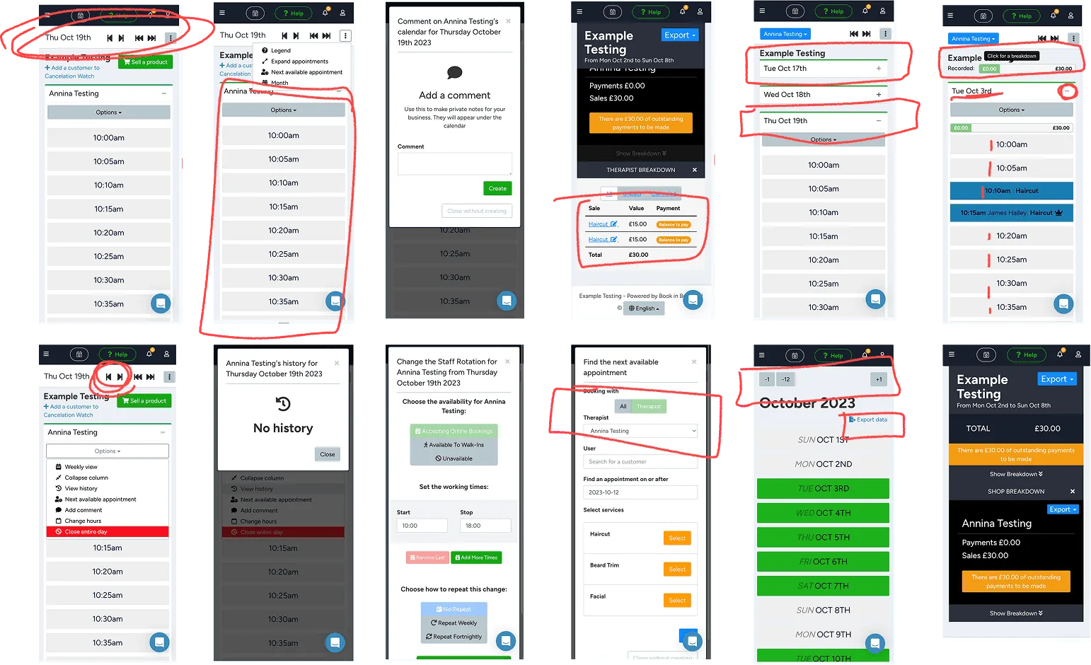
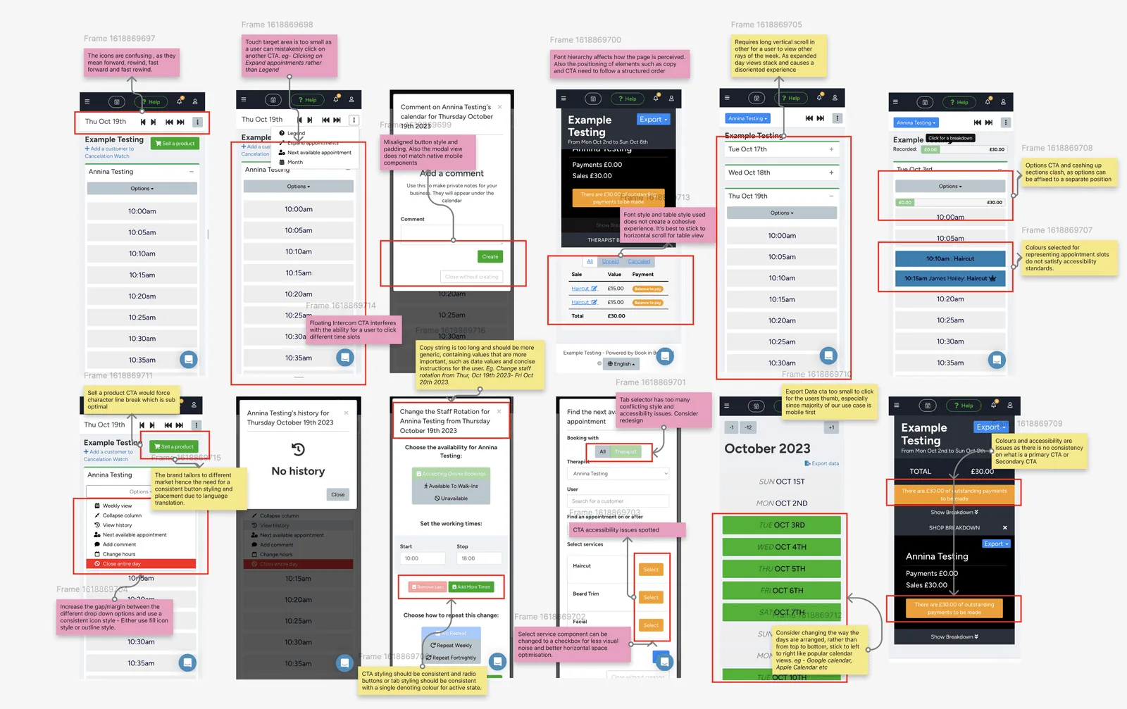
The initial discovery stage included going through the old timetable system and picking out elements that felt disjointed, isolated and confusing. By analysing the existing timetable, we noticed a lot of visual noise, accessibility pitfalls and incoherent experiences. Further analysis showed user pain-points with rescheduling appointments, managing client records, ambiguous time schedules and unclear information hierarchy. After discovery, I began mapping out existing user journeys to identify bottlenecks in staff overviews, appointment creation and staff rota management. The most commonly mapped recurring issues raised by our clients, account managers and technical support included:
😣 Complex Navigation
"I find it hard to navigate between different staffs on my phone as I would like to see what appointments my staff have for the day. I have to use my tablet."
Hair Salon Owner - 5 Staffs
😭 Confusing Time Stamps
"I hate that I have to scroll endlessly to see the different times as per appointments booked by our clients especially with our 30minute time slots."
Nail Salon Owner - 3 Staffs
😫 Inefficient Booking Flow
"Adding an appointment, blocking a time or deleting an appointment takes too many step. I have to keep clicking through different buttons."
Independent Make-up artist
👩🏼🦯 Limited Visibility
"Too many overlaps with cancellations and appointment status. It’s a bit confusing at first glance. I guess the buttons dont work."
Massage Therapist
Ideation - Initial Design Draft
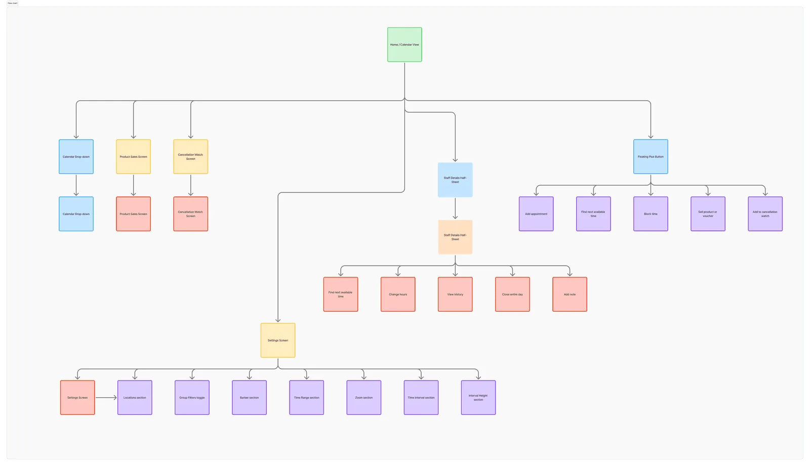
The first iteration focused on aesthetic refresh and simplifying layout hierarchy. I worked closely with a developer in creating sketches that depicted the different views, components and primary trigger points. We refined the sketches to be more concise and focused more on the timetable system rather than the actual appointments, emphasising on the different types of view, structure and information architecture to present to the clients.
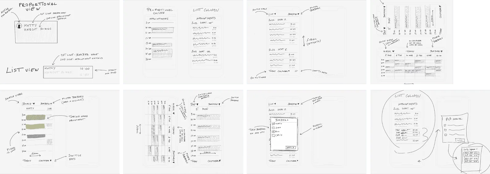
I sketched the different workflows, orientation layout and interaction points, further creating different component and wireframes to address the major faults and problems noted on the previous timetable system. My goal was to simplify the interface and ensure it’s wireframe met the goals set. This required further iteration on new components and referencing competitors, similar calendar apps and testing internally.
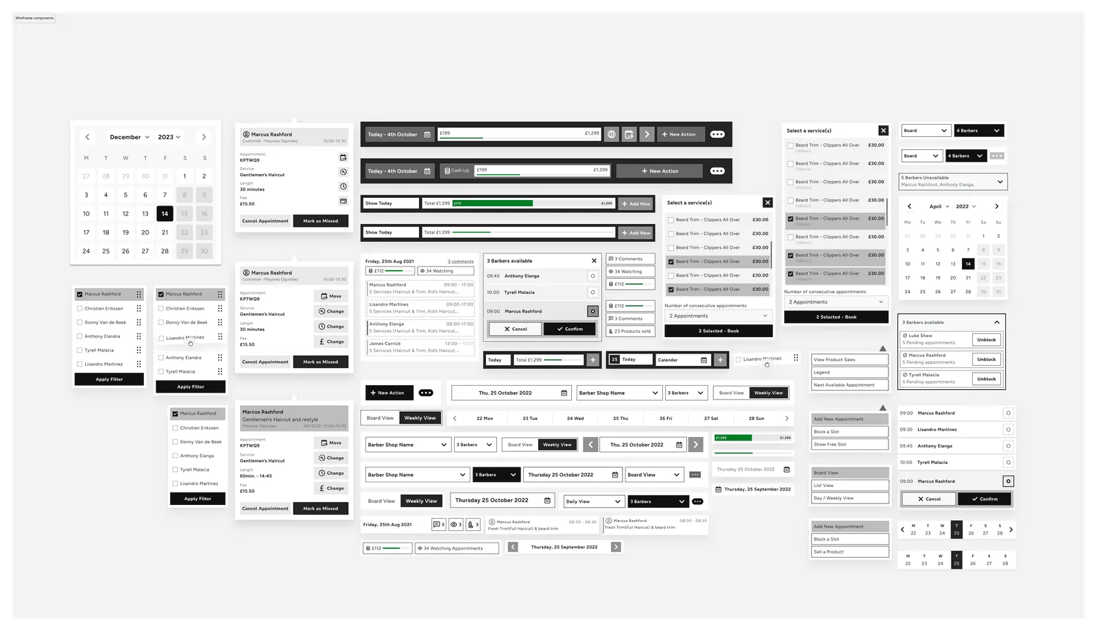
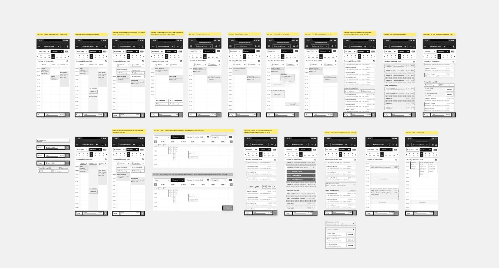
Prototyping & Testing
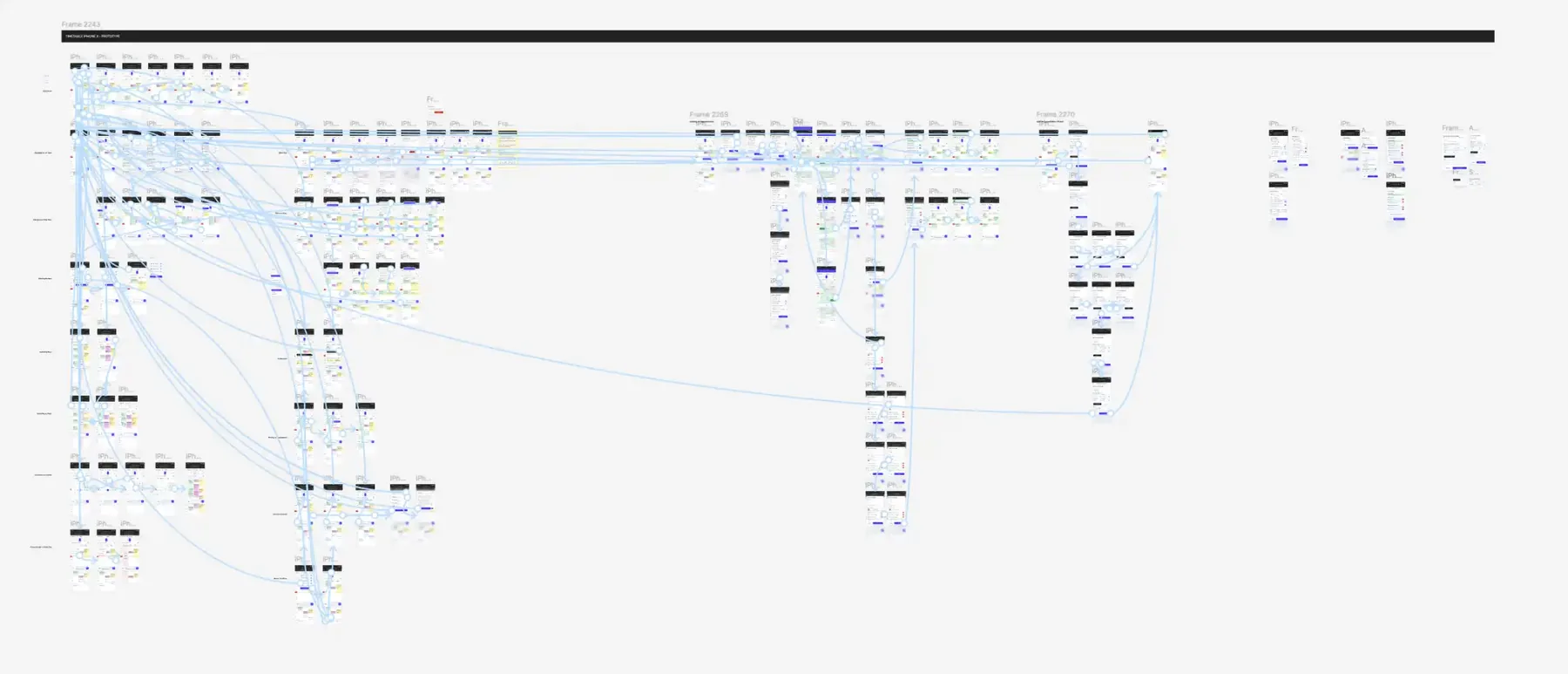
After creating the different components and mapping the different wireframe flows we needed to test our assumptions because we had a time crunch. We had a list of user actions we needed to test, and they included the core user journeys which covered most of our client’s use cases.
The journeys were -
- Changing the different timetable views - daily, weekly and board views,
- Filtering the different staffs (Barbers
Therapists), - Viewing multiple staffs (use case of 4/5 staff columns),
- Switching to different days, different months and
- Moving an appointment across different staff and times.
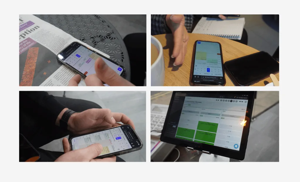
Upon completing the prototypes, we ran a moderated usability sessions with 10 existing clients, I interviewed 4 clients, while an external User Researcher by the name “Chris” helped us conduct the remaining test with clients (salon owners & staff). We measured the different Task completion time, Error rate, User Satisfaction, Overall Usability & Accessibility.
Optimisation & Iteration
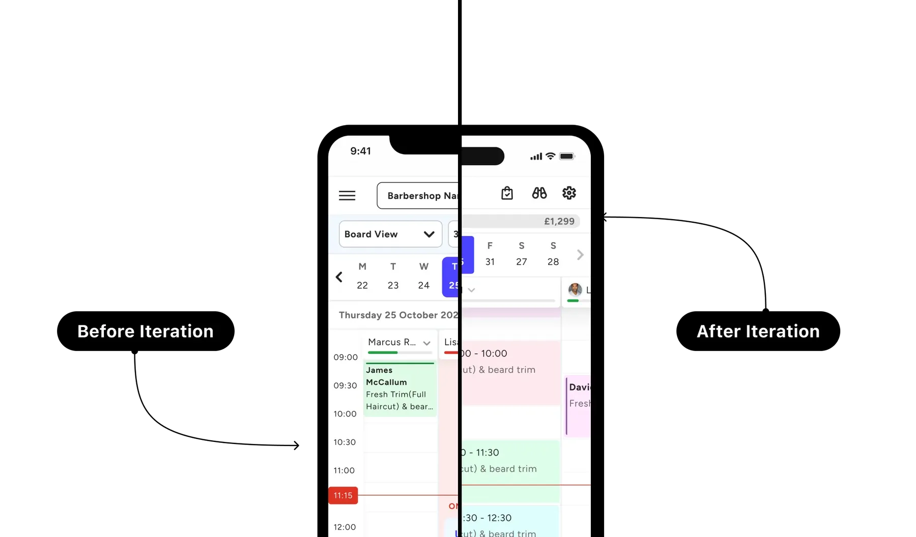
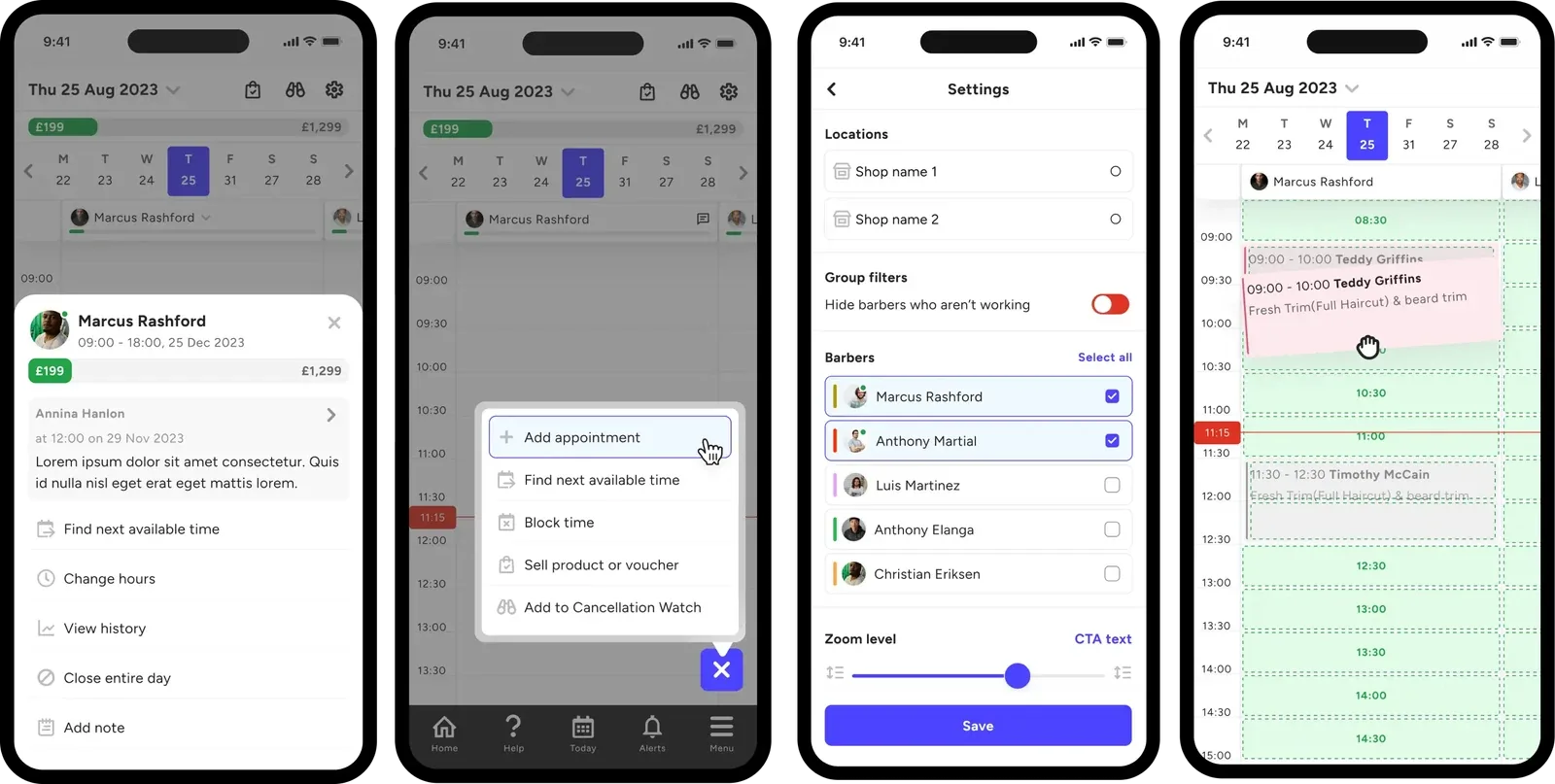
Based on feedback and the analysis from our user test, we decided to redefine the user journey, improve the architectural logic (This required backend dev. support) and optimise the layout. We introduced drag-and-drop booking directly on the timetable grid, significantly reduced vertical scroll caused by clustered header elements, adopted sheet components to view real-time staff information and enabled multi-staff view toggles with colour-coded identification.
This involved a lot of collaboration with developers to ensure performance remained optimal with dynamic updates. Our redefined user journey and improved logic paid off as the final outcome looked cleaner with a better improved drag and drop functionality, sheet components and overall smoother interactions.
Design Solution
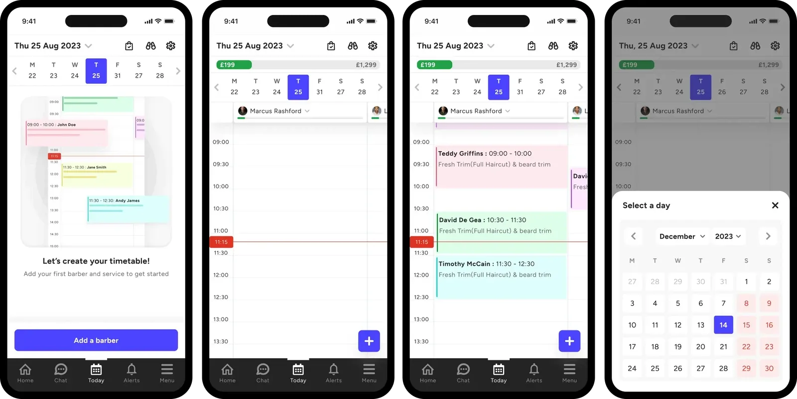
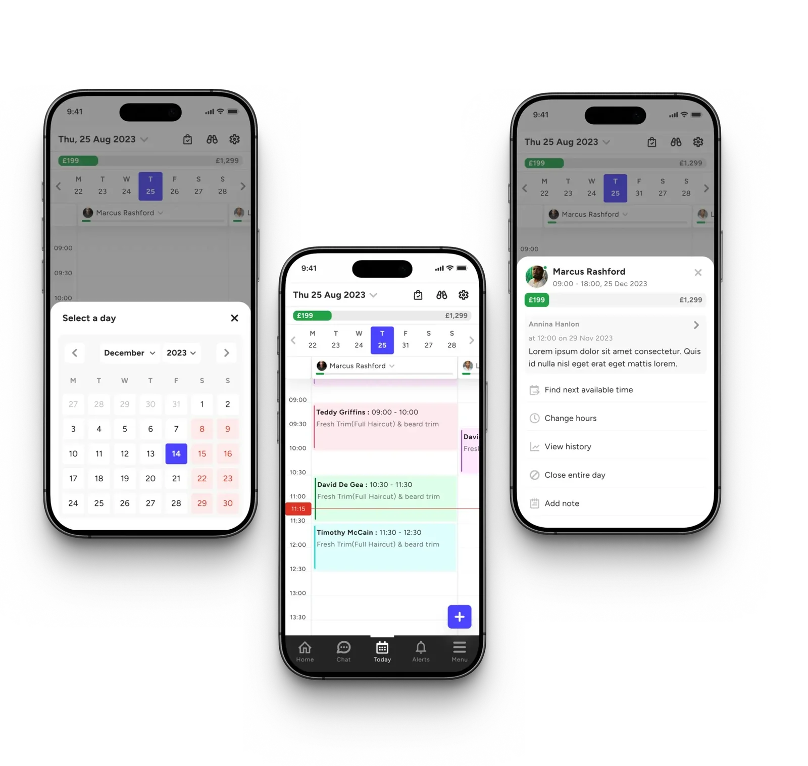
With a clearer picture of client pain points, client feedback and stakeholder alignments, I focused on redesigning the header section, cashing up tool, the footer section and calendar components. The staff columns were refactored and streamlined to 2 column per screen based on existing client data, with the second one slightly visible for clients to click on. Some key design patterns adopted ensured emphasis was on the interface being :
- Clean, modular timetable grid that adapts across staff, days, and device sizes.
- Colour-coded appointment blocks with clear visual hierarchy for appointment types/status.
- Persistent top navigation for quick access to date range, filters, and view toggles.
- Contextual editing: users can click directly on a time slot or existing booking to modify details instantly.
- Optimisation for responsive devices, particularly tablet and desktop.
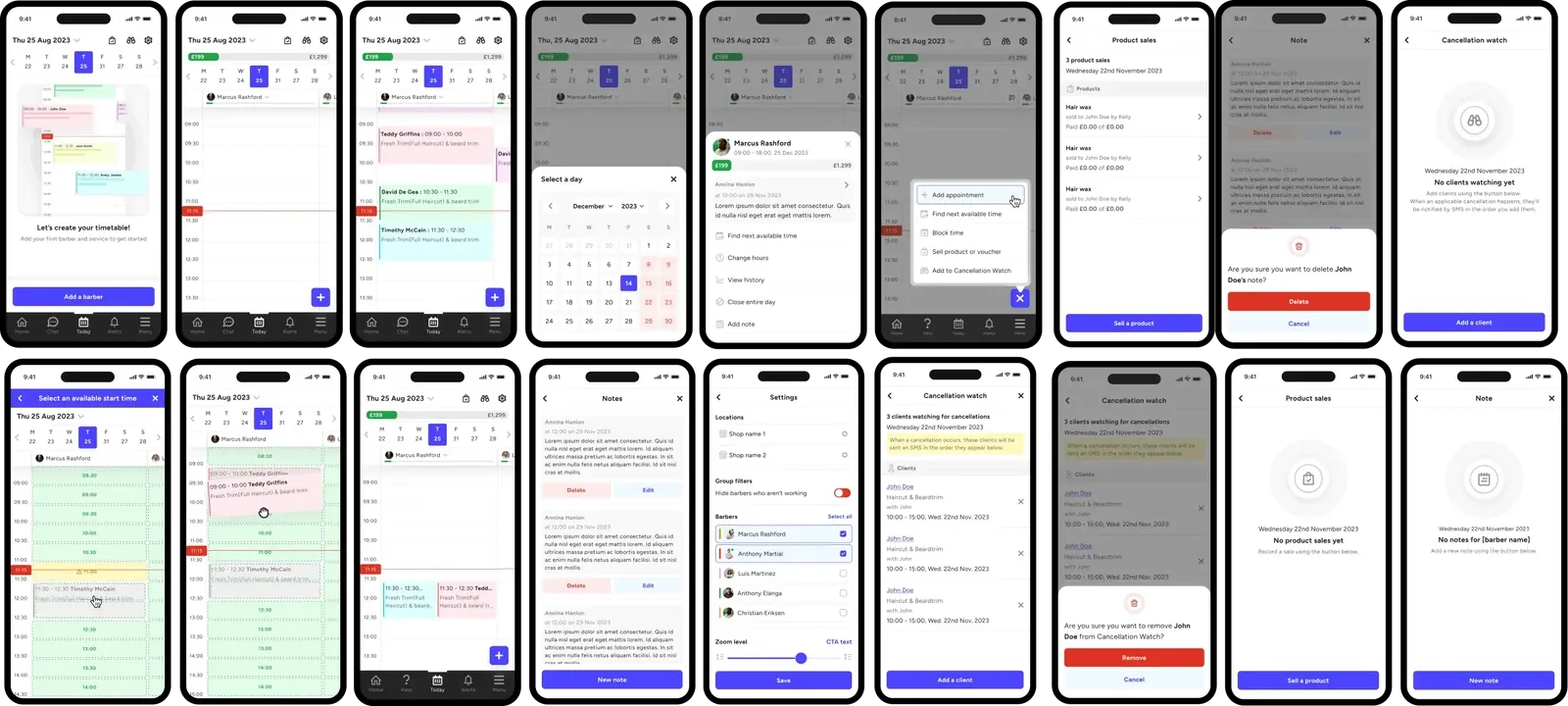
After deploying the new designs to our clients, we were able to measure our performances:
Faster average appointment creation and staff management time.
Reduction in vertical scroll fully optimised for mobile devices
Reduction in slips and error rate caused by the old version - CTA tap target.
⭐️⭐️⭐️⭐️⭐️
Overall positive excitement and feedback from our clients and internal teas - Sales, Account Manager and stakeholders. One of our clients who gave us a 5 star rating, thanks to our talented team of account managers stated;
This feels like a lot of weight has been taken off my shoulders”. Reminds me of my Google calendar, which is something I use alot....”
Outcome and Business Impact
Within three months of launching the redesigned Timetable module, we observed a 32% increase in appointments managed per staff indicating stronger engagement and overall usability improvements. Additionally, support tickets related to staff rota management and appointment overview dropped by 41%, significantly reducing operational overhead and freeing up internal resources. Sales and Account Management teams also reported higher onboarding satisfaction, citing smoother customer adoption and clearer product value during demos. Beyond these quantitative results, the redesign enhanced user confidence, simplified complex workflows, and established a scalable foundation for upcoming integrations such as payments, staff analytics, and AI-powered scheduling.
Learnings and Reflections
Throughout the project, several key learnings emerged. First, iteration proved to be essential — the initial “good” design only became truly effective after it was tested and validated with real users, highlighting the importance of continuous feedback and refinement. Collaboration with non-design teams such as Sales and Account Management provided valuable, real-world perspectives on how customers actually used the product day-to-day. Also upon testing, we discovered that our barber clients preferred the older version compared to our beauty clients. This we took into account and ensured we did not shove the new version down our client’s throat by providing upgrade options.
Next Steps
Looking ahead, the focus will be on creating animated onboarding walkthrough for existing clients who want to migrate to the new timetable design. I created the animations by using Figma prototype, and a WebM conversion tool. This was an entirely different project as our goal was to create email campaigns, push notifications and in-app banners to upsell the new timetable. Finally, ongoing feedback collection through in-app surveys and usability sessions will guide future iterations, keeping the product aligned with user needs and industry evolution.