

UX Cards
A clean set of reusable best-practice cards for product designers. I made them for UX designers who want to add the cards to their library and use them as references for validating design patterns and design choices.
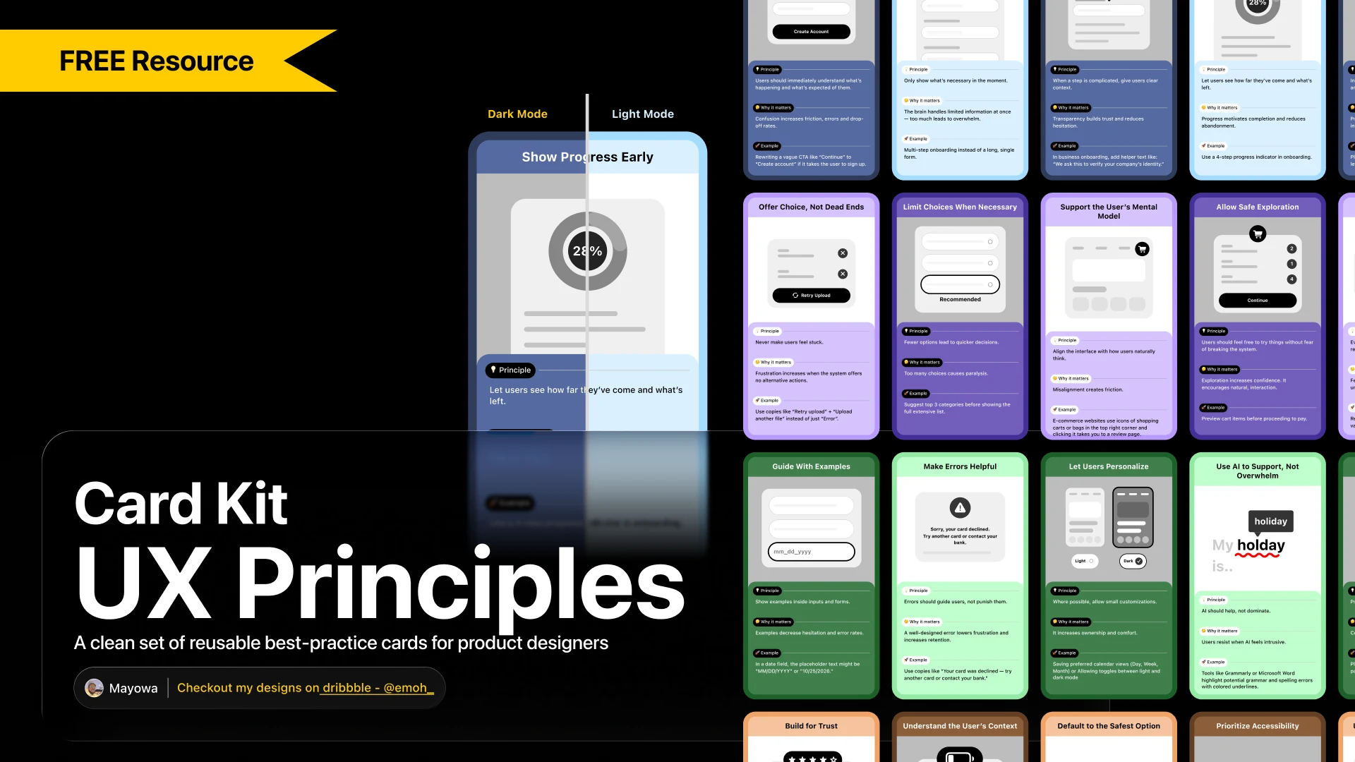
UX principle cards
colour-coded themes
designers using the file
likes on Figma Community
Why I made it
Every design file is full of small pattern decisions. I wanted designers to have a set of trusted references they could add to their own library and pull up right next to their work, to check a pattern or back up a design choice.
Anatomy of a card
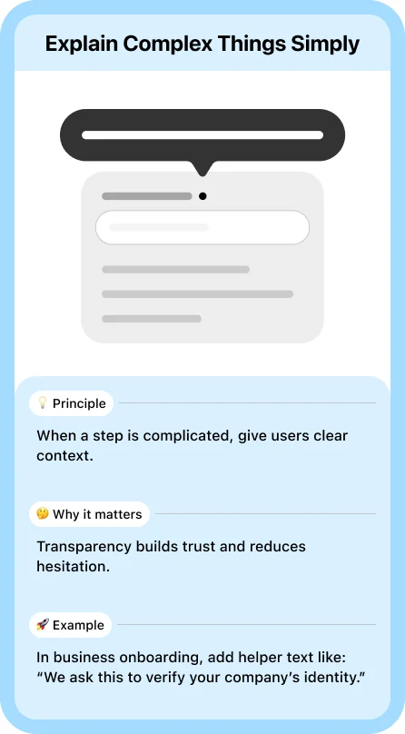
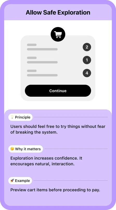
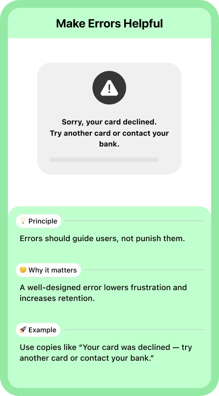
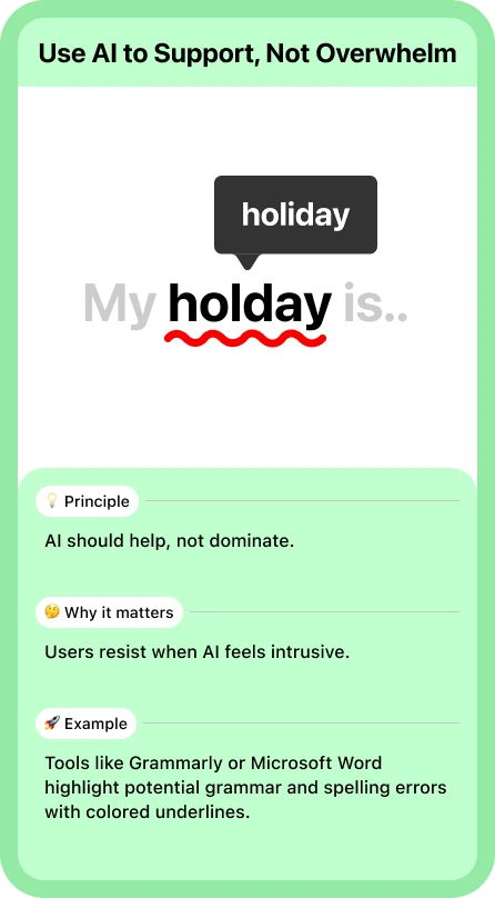
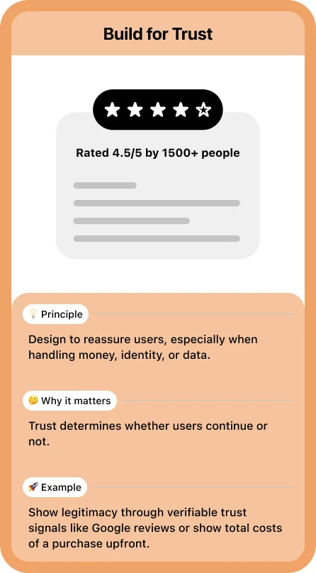
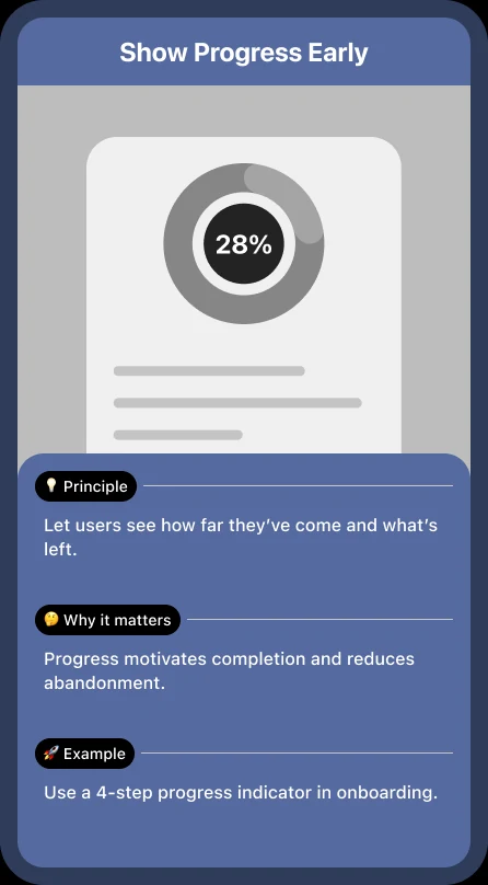
Every card follows the same structure, so it reads at a glance: a title, a simple sketch of the pattern in use, and three short parts.
- 💡 Principle: the rule in one line.
- 🤔 Why it matters: the reasoning behind it.
- 🚀 Example: a real situation where it applies.
Four themes, one colour each
The 30 principles are grouped into four themes, and each theme has its own colour so you can find the right card quickly.
- Clarity & Understanding8 cards
- Flow, Navigation & Structure8 cards
- Communication & Guidance8 cards
- Trust & Behaviour6 cards
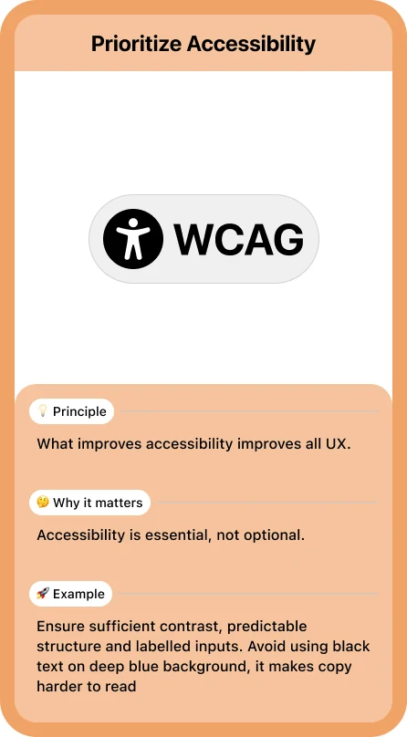
Light and dark mode
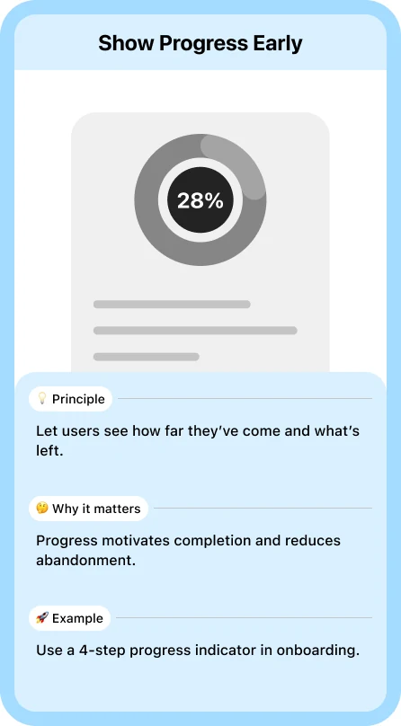
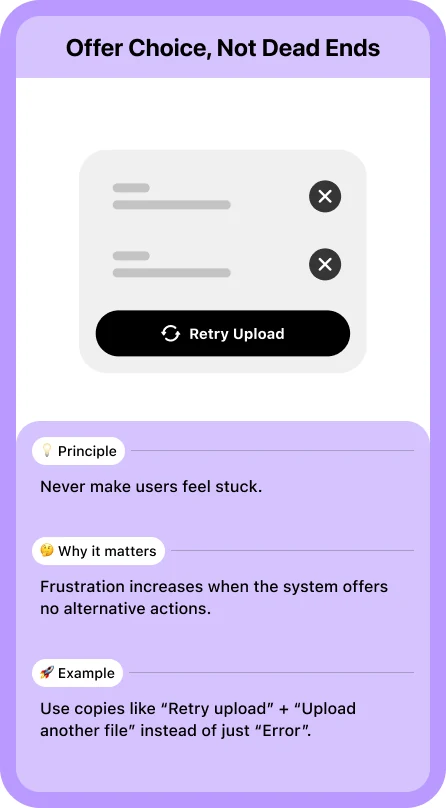
Every card comes in a light and a dark version, so it fits whichever theme your file or library uses.
Where it is now
UX Cards is free on Figma Community. 44 designers are using it so far and 7 people have liked it.
Get UX Cards on Figma Community ↗