

Powering Sales Growth Through a Better Lead Search for Skrapp.io
Skrapp.io is a B2B lead generation platform that helps users find verified professional emails and build targeted prospect lists. It’s widely used by sales and marketing teams to identify decision-makers and connect through cold outreach.
The Lead Search and Company Search features are two of the most critical touch points for users. They drive the discovery, validation, and export of business leads. These features were outdated, both in UX and visual design, as they lacked a scalable system for future improvements. Also no designer had ever worked on these features, hence it was a great opportunity for me to showcase my skills.
user satisfaction score from an initial score of 61
reduction in average time to navigate and find a lead
increase in clarity of the page’s information hierarchy
The Challenge
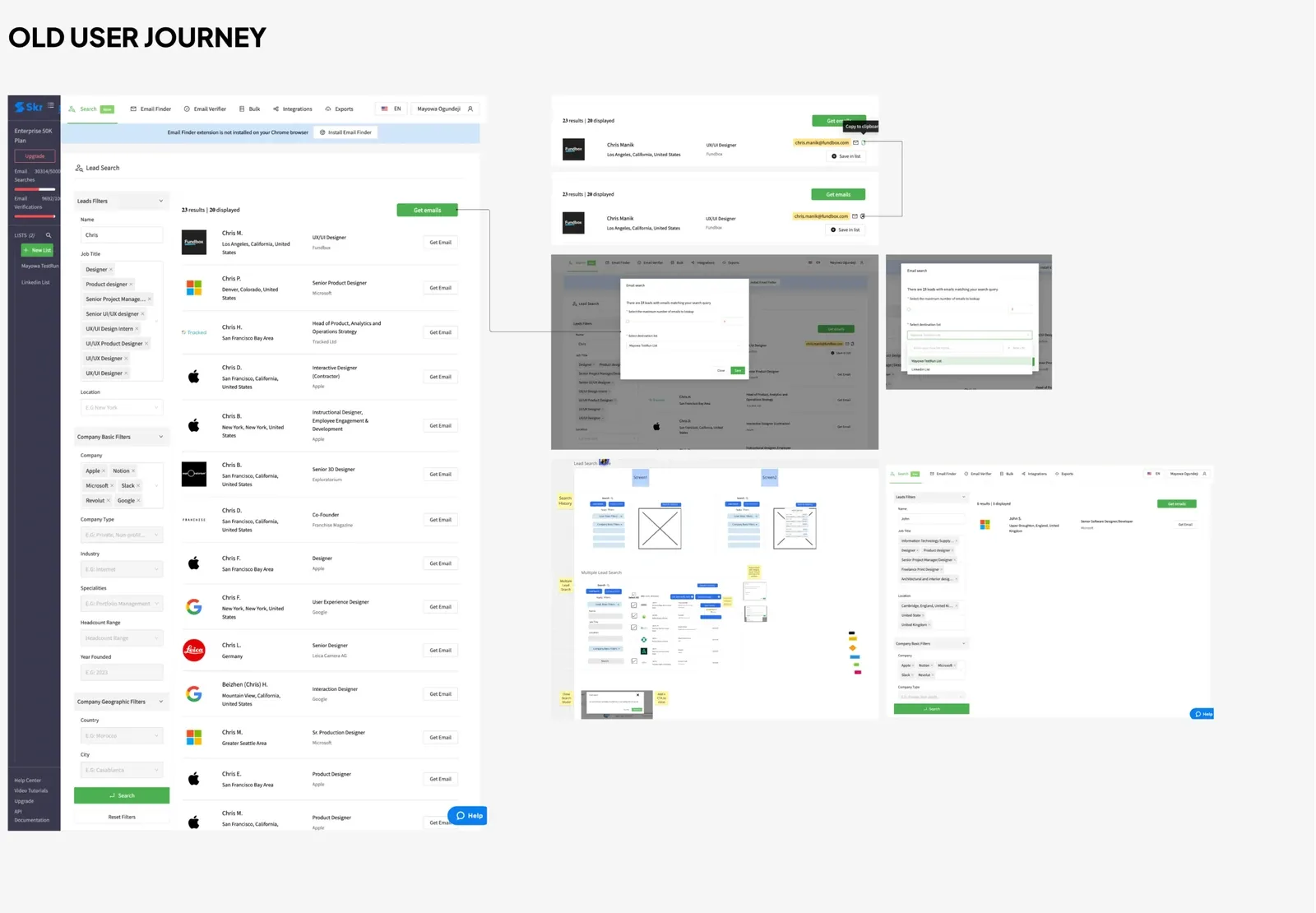
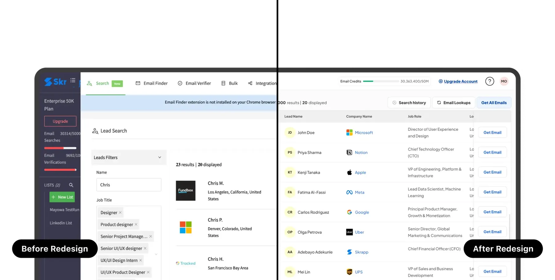
Joining Skrapp as the founding designer, the lead search feature provides the most significant value proposition for users. It sits at the heart of Skrapp's product offering and it's used by 1m+ users, yet it's user experience was never considered. It's data accuracy was spot on but users struggled with usability issues such as navigation, inconsistent experiences, unstructured data format and confusing information architecture. Also, the products lacked a cohesive and coherent design pattern. Further investigations revealed there was a lack of design system, as well as UI component libraries. These led to increase in duplicated List items, and lack of scalability in the system. Overall, this was a very disjointed user journey and it urgently needed refactoring.
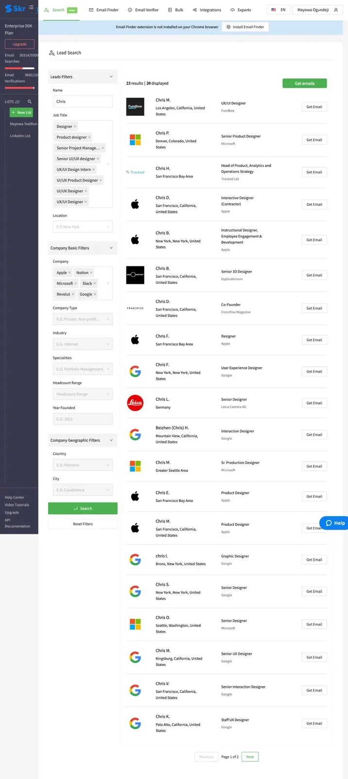
↳ Old Lead Search Design
My Role
As Lead Product Designer, I directed the UX and visual redesign of Lead Search and Company Search. I mentored and guided a contracted Product Designer ensuring we maintained design consistency and shared knowledge. I created new design system components, tokens and UI kits. We use agile workflows to collaborate with PM and developers with 2 weeks sprints. Lastly, I partnered with developers during QA to maintain perfect implementation and accessibility standards.
Our Goal
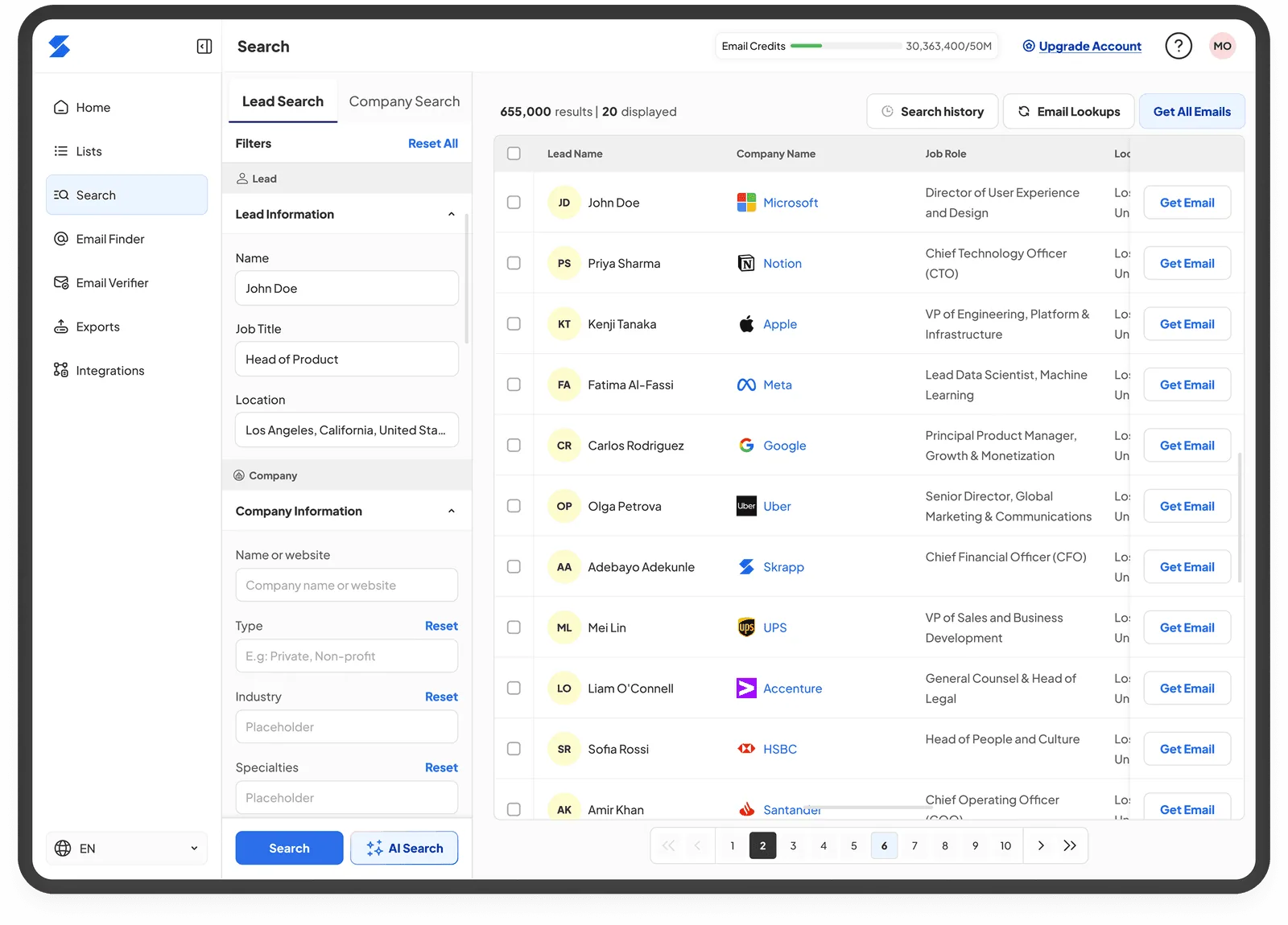
Redesign the Lead Search feature with the Company Search feature and simplify their user journey by making them clearer, less overwhelming and more intuitive using limited user logs to increase revenue. Create a unified scalable design system which included components, tokens and UI kits and finally ensure the redesigned Lead Search and other features support future AI-driven capabilities as this was part of the product roadmap.
Process - Iterative Design
Competitor Research & Discovery
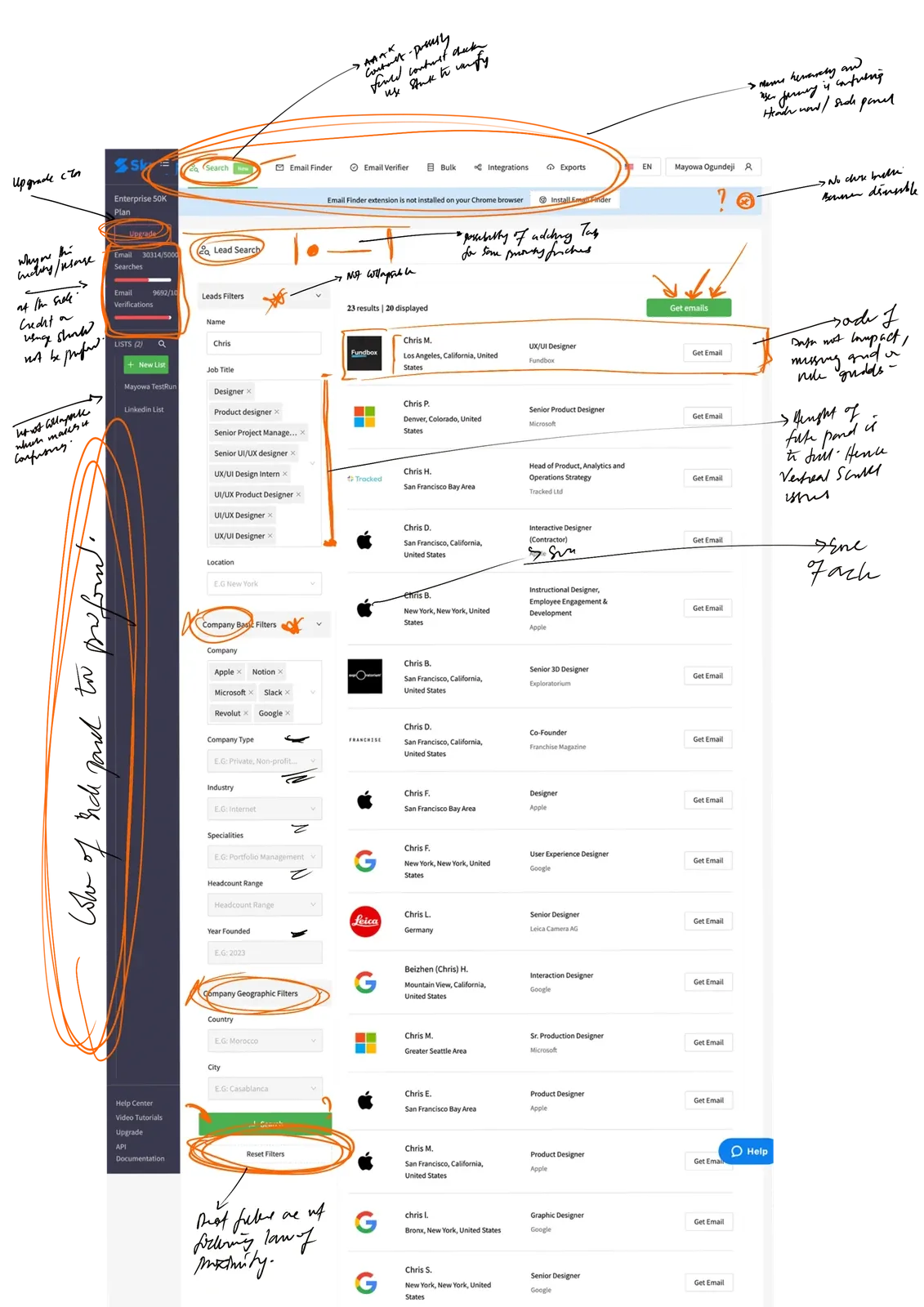
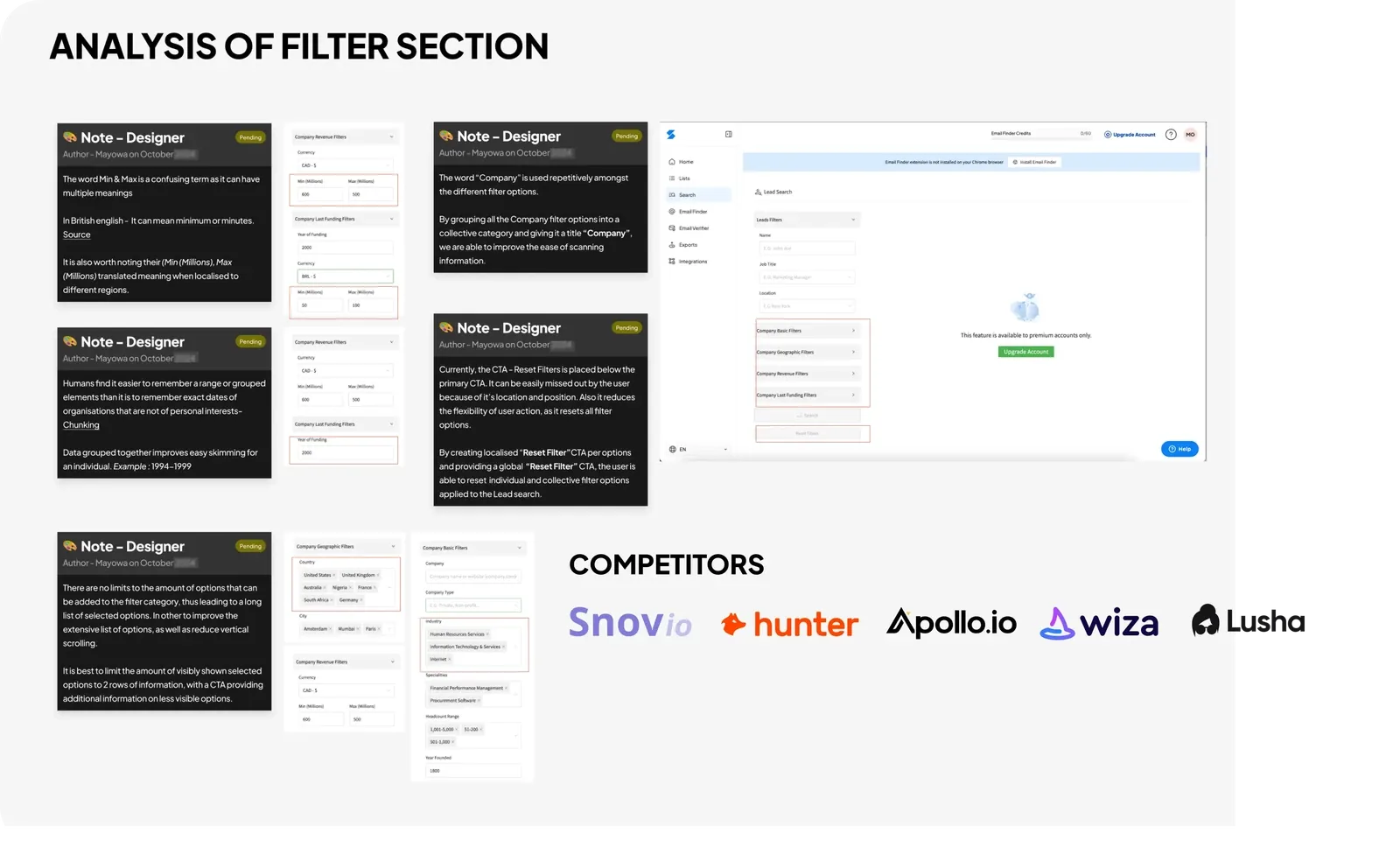
I started with an initial system tour to get a good understanding of how the feature works and how it was primarily integrated with the Company Search feature and other features such as - Lead List, Bulk Email Verifier. After analysing the system and making notes of potential red flags, I teamed up with a Sales team member to get a better understanding of what problems and potentials have been highlighted by users, particularly enterprise users. By analysing the data and carrying out a competitor’s analysis to better understand how similar features work, I was able to estimate the deliverables for this project per sprint.
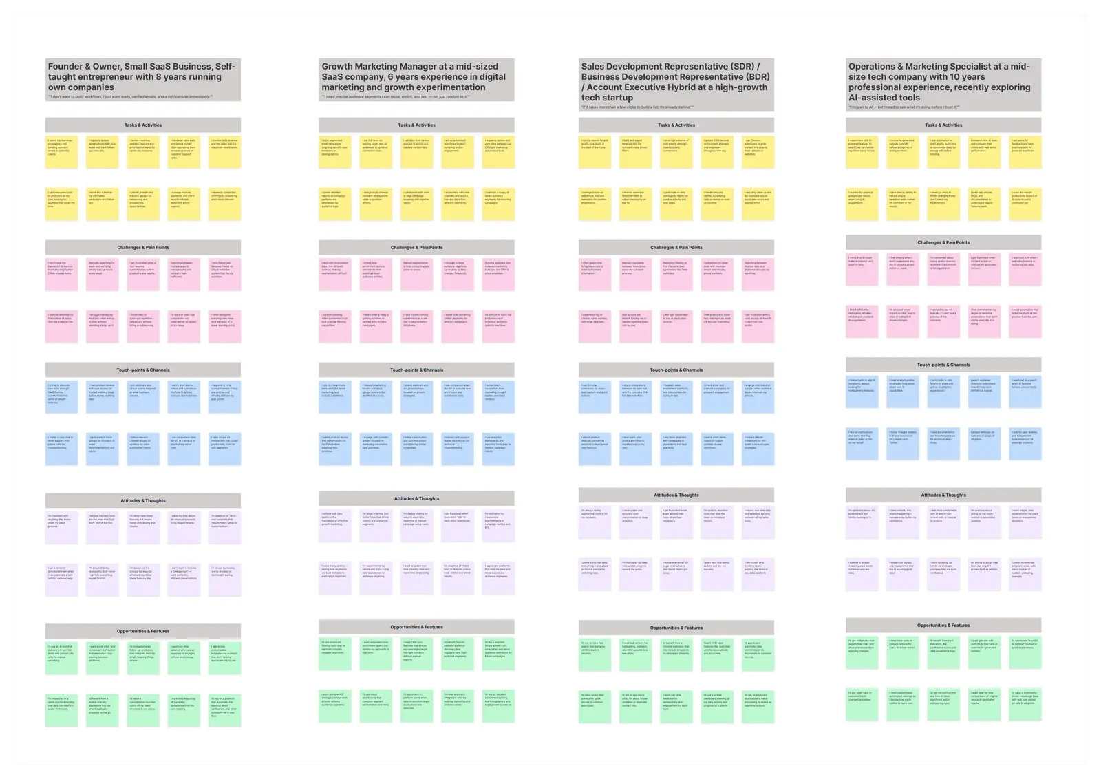
I decided to also get a clearer understanding of how marketing team used our products in identifying potential leads for cold outreach by scheduling multiple meeting sessions and interview sessions. After those sessions, I collaborated with stakeholders to dig deeper into our support log and Chrome extension review feedback. Gathering all these data and information gave me the super powers needed to tackle this wicked problem. Some key insights include:
😕 Fragmented UX
"Lead Search which is linked to Company search had inconsistent flows which made the ux confusing."
😭 Poor Lead Data Table Structure
"Dense, unstructured tables made it hard to scan, compare, and manage large lead datasets."
😳No Design System
"Each feature had different UI patterns, leading to inconsistent development and user confusion."
😤 Unclear User Navigation
"Navigating from finding the feature, to performing a search and extracting emails proved cumbersome"
The Foundation - Design System
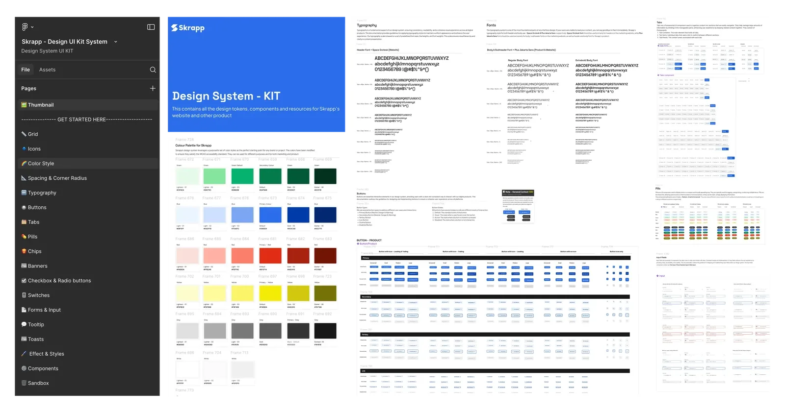
As there was no existing design consistency due to early reliance on Material design components, I initiated the proposal to build ours and collaborated with 2 full stack developers in implementing the different tokens and components. I had a meeting with stakeholders and we decided to refactor the existing app icon, by making it more modern and creating more visual symmetry with the brand name. I created the different colour palettes, typography styles, paying particular attention to the different kerning and leading properties of different font families.
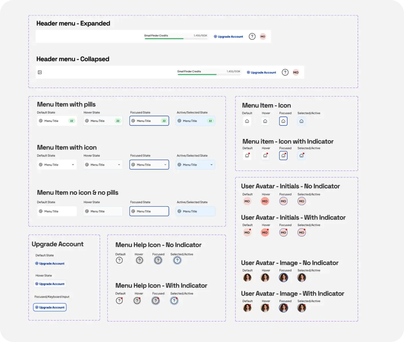
I created the spacing guidelines, grid rules, variables, styling, atomic UI components which consisted of buttons, tooltips, inputs, drop-downs, tabs, modals, banners and more complex components like the product menu side-panel. We tested the scalability of the different tokens and components and ensured they adhered to accessibility standards. After working on these, I created hand off documentations for developers to kick start the first phase of development.
First Iteration - Flows & Components
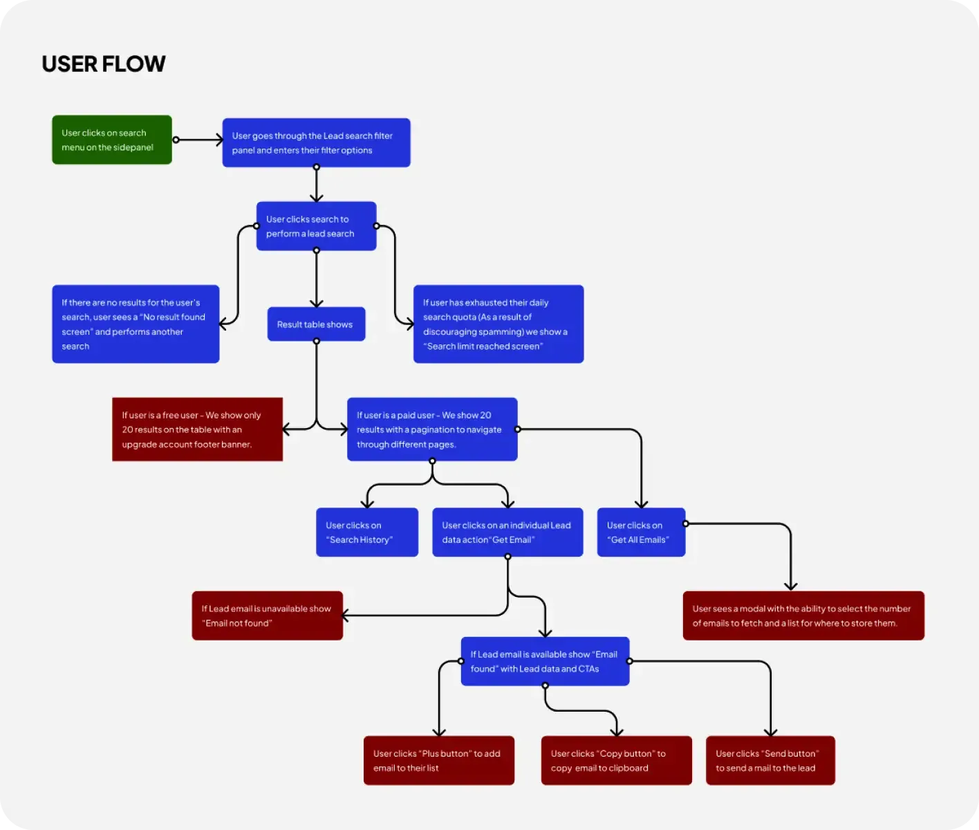
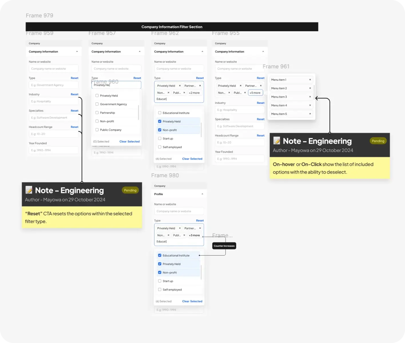
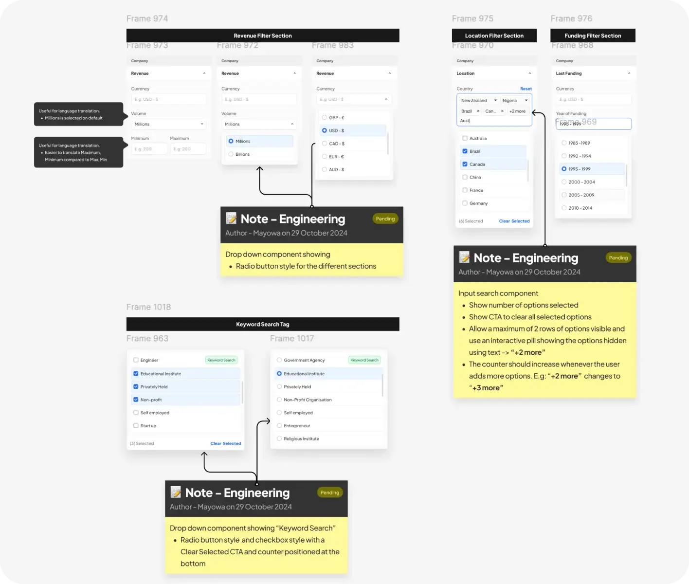
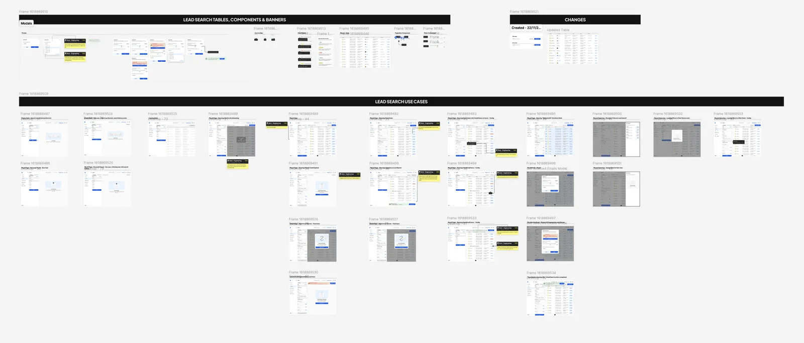
I started with Lead Search, being one of the most used features. I redesigned the search experience by creating a high level user flow to depict the majority of use cases as I needed to understand how the data table would influence the design decision. I had a meeting with developers and PM to establish the scalability of the data, the existing logic and minor feature improvements we planned on shipping. This information helped me design the different filter components and actions we would presenting to our users and the core purpose of what each data set provided to our users.
Simultaneously, I and the product designer started working on external modular components such as header menu, menu item variants and modal layouts. We needed these global components for other features such as Lead Lists, Email Verifier and Bulk Email Verifier.
Testing & Validation
We ran an internal blackbox design test to validate our hypothesis on the filter options, tab usage, CTA discoverability and other functional logic. We noticed a higher user satisfaction score jump from 61 - 82 for the lead search, an average time to navigate the page and find a lead reducing by 20% and overall clarity in information hierarchy increase by 45%. After our test and success, we decided to roll out the feature for users.
user satisfaction score from an initial score of 61
reduction in average time to navigate and find a lead
increase in clarity of the page’s information hierarchy
Second Iteration - Reordering Table Data
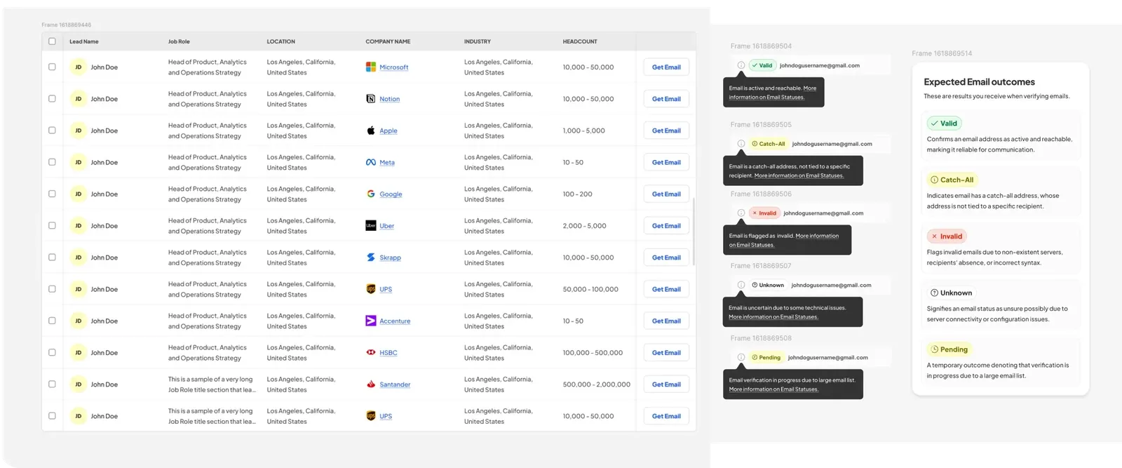
After our initial success in testing the different components, we needed to iterate on the order of information shown on the table as well as the different uncovered edge cases such as character limitation, different email statuses, missing company avatars and incorrect data. I created different screens for all the edge cases per different users - free users and premium users. This was relatively easy to achieve as I had already created the general layouts, data table and bulk action screens. We decided to deploy this to production as we were a little behind on our product roadmap deliverables.
Third Iteration - Integrating AI Search Feature
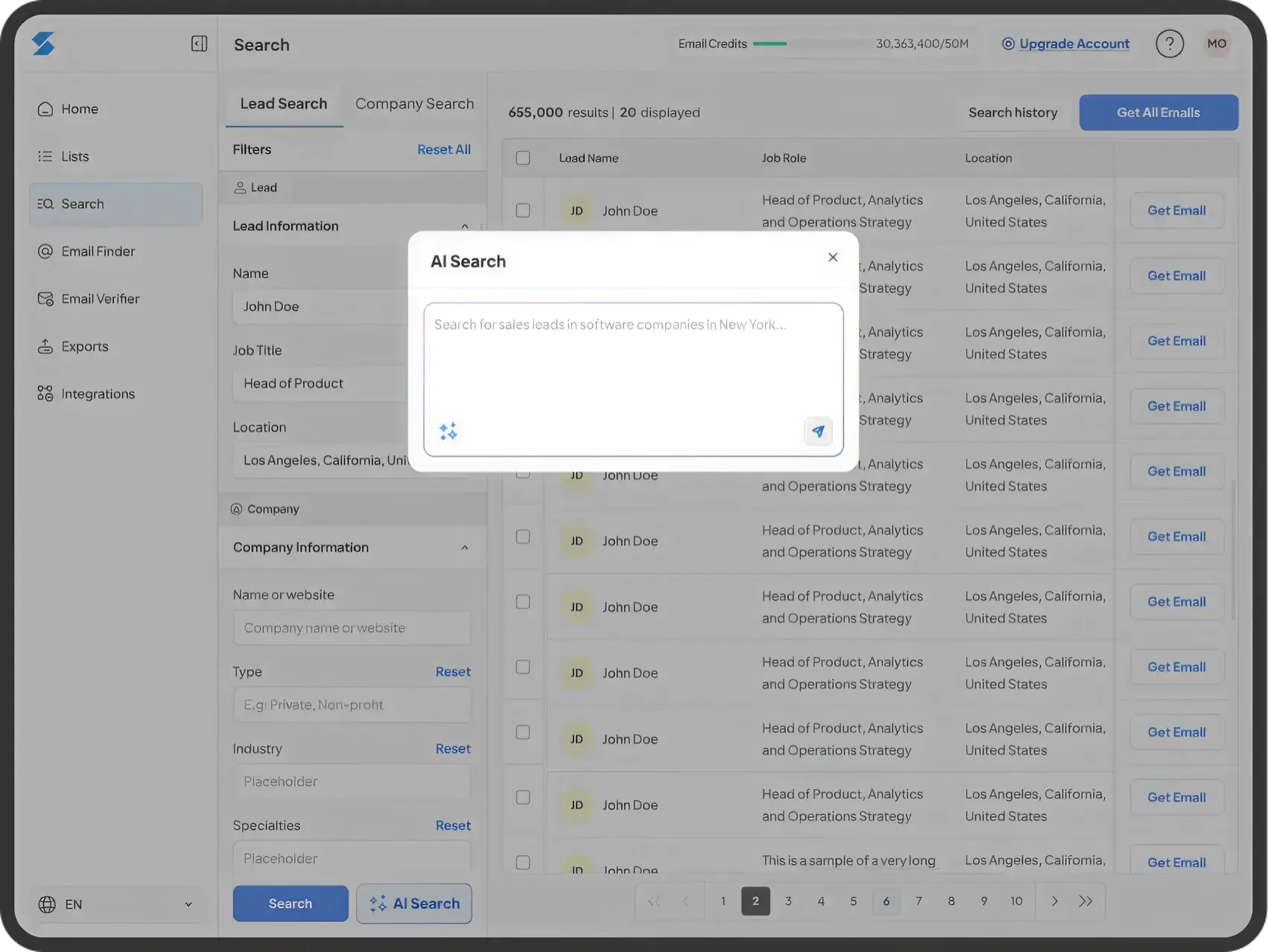
After our second iteration and seeing how users welcomed the change (Thanks to marketing communication sent out, and our redesigned in-app modals used for announcement), we decided to internally rapidly prototype, iterate, test and select final designs to be deployed to users. While redesigning the Lead Search, we had already envisioned an AI-powered discovery assistant which would cover these core use case.
- Users input a brief description of the type of leads they need (e.g., “Marketing Managers in SaaS companies in Germany”).
- The AI feature searches LinkedIn and the web to generate a lead list table automatically.
- Users can review the list, modify, the filter params and save lists instantly.
This integration transformed the product from a passive search tool into a proactive, intelligent lead generation engine and so I updated the designs with these new feature.
Design Solution
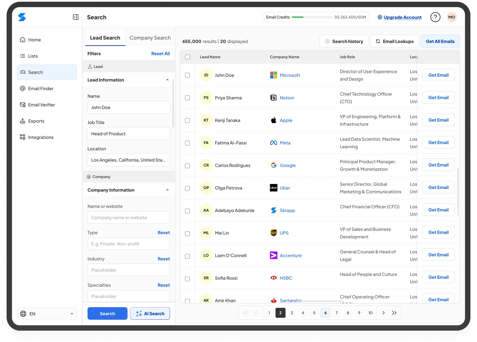
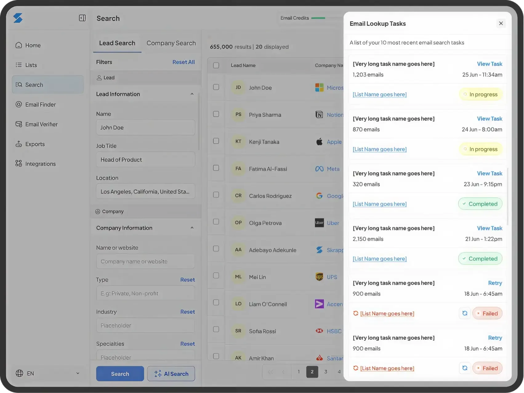
The design solution involved the use of tabbed navigation for users to navigate between “Lead Search” & “Company Search”. A clean search filter component and smart defaults, responsive data table that supports multi-select, left to right horizontal and vertical scroll with an overlayed walkthrough guiding first time users, easy AI-driven lead search integration with natural-language inputs, search history and a live tracker of lead search current tasks for users to review.
Outcome and Business Impact
After launch we monitored usage and support tickets to see what we could improve. We noticed a 45% increase in Lead List creation as a result of increased Lead Search usage, 63% reduction in support tickets specifically related to the use of search filters and a 16% increase in trial-to-paid user conversion with a primary focus on conversion from Lead Search. This was a start to the revamp of all features
Increase in Lead List creation caused by Lead Search usage
Reduction in support tickets related to search filters
Increase in trial-to-paid conversion with focus on LS
Learnings and Reflections
Before starting this project I had imposter syndrome as I wondered if I could handle all the ambiguity such as the lack of sufficient user data, leading a contracted product designer on different projects, and creating impact. However, it made me realise how important putting in extra hours of work and time into self-development, knowledge growth and design craftsmanship helped. Design leadership goes beyond visuals but requires mentoring and establishing standards that would have a lasting impact long after we are gone. It requires creating a safe space for design to thrive.
Building a design system early saved time and created consistency across future redesigns as early collaboration with developers ensured smooth workflows. Adopting an agile process enabled us to move fast without sacrificing quality as we ensured sprint retros helped us improve generally. Integrating the AI feature is a first start to evolving and I’m eager to see it’s growth.
Next Steps
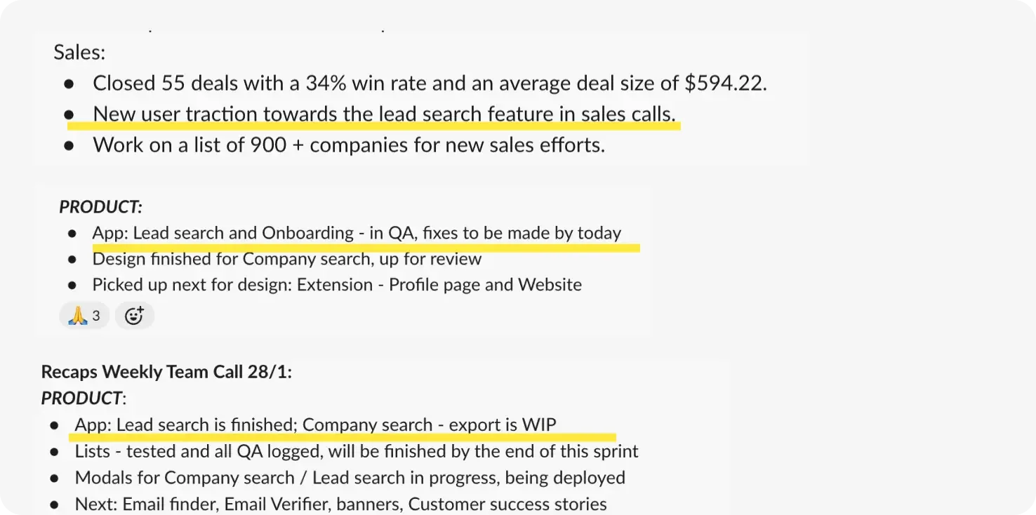
Iterate, on Lead Search by adding statistics and new columns to the Lead Search table such as "Buying roles, Seniority level and Gender". Also improve the app onboarding for new features added by creating animated walkthroughs, and finally keep testing and measuring performance across the Lead Search & Company Search feature.